More self-promotion . . . from September 15th a solo exhibit will open at the LJG Gallery* with three of my recent projects. Sarra, of course (read more here and here,) and also Les Contes de Camondo, a series I did on the Turkish-Parisian family who left us the stunning Musée Nissim de Camondo in Paris. The third project is about my grandfather Eli’s youth in Amsterdam’s poverty-stricken Jewish Quarter, around the year 1900.
In the mid-nineteenth century, the Turkish-Jewish Camondo family of bankers settled in Paris where they became avid art collectors. One of the sons, Moïse, married and had two children, but within years his wife left him. So Moïse raised the little ones by himself, in the beautiful house by the Parc Monceau that he had built around his ever-growing collection. He worshipped his son Nissim, and feared the worst when the young man enlisted for the French air force during WWI. On September 5th 1917 his nightmare became reality. Moïse was inconsolable and retired from work and public life. He died in 1935, leaving his entire art collection and his house to the French state on condition that the house would be a museum in memory of his son. His daughter, her husband and their two children were murdered in Auschwitz.
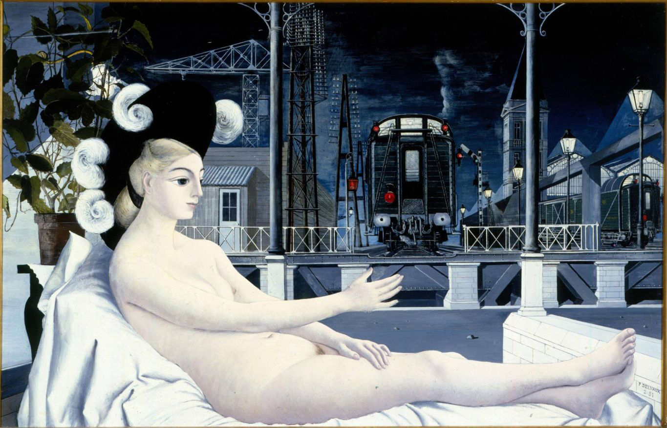
Rudolf Lucieer is Moïse de Camondo, David Lucieer is Nissim.
The story of my grandfather Eli de Vries (1890-1969).
All I know about his youth, in Amsterdam’s Jewish Quarter, is that he had to go to work at the age of six. No idea what he did – running errands probably for the neighborhood shopkeepers. Maybe he helped the local photographer? Was he a delivery boy? Did he pick up dirty laundry? I hope he had some time to play with his brothers and sisters – he had two older halfsisters from his mother’s first marriage, and four brothers and a sister, all younger. Of all eight only Eli and his brother David, four years his junior, survived the Holocaust. First they lived in a street called the Dijkstraat, later they moved to a canal called the Rechtboomsloot. The house on Dijkstraat no longer exists, the one on the canal looks glorious now. But when they lived there, all ten of them, it must have been a disaster. I’m sure they didn’t have the entire house to themselves.
Life treated Eli well. He had three daughters, three grandchildren, and together with David he ran a successful Dutch-American business. He moved to New York and held office at the Chrysler Building.
This is my hommage to him. To him, and to all the desperately poor little Amsterdam boys who, against all odds, made it possible for little Amsterdam girls to grow up in peace and comfort only sixty years later.
Amos Hartogs is my grandfather Eli. He is eight years old.
*The gallery of the LJG synagogue, Zuidelijke Wandelweg 41, Amsterdam. By appointment only, if you want to go there call them on 020-5400120 or drop us an email: hello@tpramsterdam.com.
My latest project, SARRA, YELLOW VEIL, will go on show this coming Sunday (6-19).
The exhibition will run from June 19th through to August 7th 2022
at The Amsterdam Picture Room, Tweede Laurierdwarsstraat 53 h, 1016 RA Amsterdam
opening hours: Saturdays and Sundays 1 – 5 pm, and by appointment.
You can read more about Sarra here, but let me give you some background information about the project and how it came about:
Three years ago, while preparing a month-long stay in Venice, I came across the story of Sarra Coppia Sulam, the poetess, musician, salonnière who lived in the Venetian Ghetto during the early 17th century. I immediately knew she would be the subject of a photo series.
But it took time. While I was there, other stories drew my attention; I got caught in the devastating flood (check out this post) – then there was a small issue with a pandemic, but now it is done! Sarra’s on the walls!
Wonderful Dutch actress Nyncke Beekhuyzen volunteered to be my Sarra, thinking along with me, coming up with invaluable ideas, giving me lots of her time in between rehearsals, performances, filming, and her young family.
My research led me to an amazing, very comprehensive book about Sarra by professor Don Harran. Unfortunately he is no longer with us, but I want to thank him posthumously – I couldn’t have done it without his book.
I concentrated on the fascinating correspondence Sarra had with Ansaldo Cebà, a Genovese monk thirty years her senior, that lasted four-and-a-half years and became decidedly steamy. All that time he tried to convert her to Christianity, she steadfastly refused to give up her Jewish faith. They told each other off, but they also exchanged poetry and wrote songs for each other like turtledoves.
Now here’s the thing: he copied all of his letters to her before sending them, but he lost – threw away? – her letters to him . . . and after they stopped communicating, a few months before his death, he had his letters published. (Which apparently was not an uncommon thing then.)
Reading up on Sarra, picturing her life, designing and sewing her clothes, I became so curious about her letters, that I decided to write them. We had crept under each others’ skin, anyway – I figured I might as well. And of course I had Nyncke to read them – she did so beautifully. So now Sarra graces the walls and her voice fills the room.
The title, by the way, refers to the fact that for the women of the Ghetto it was mandatory to wear a yellow veil – the men had to wear yellow hats. God forbid you’d meet a Jew without knowing it! The ghetto had three entrances – bridges – that were guarded by soldiers and only opened between sunrise and sunset. If you were outside after hours you’d face quite severe punishment.
There’s much more to tell about Sarra, but I really hope you can come and meet her if you are in Amsterdam this summer! By all means get in touch: hello@tpramsterdam.com, we’d love to hear from you.
I need to get something off my chest. I often hear people speak about models in a slightly condescending manner: just pretty faces, bimbos that don’t need to do anything but strike a pose. Well, no. It’s a trade. And a tough trade at that. Artists’ models who, often stark naked in a freezing studio, stand for hours in weird contortions – photographic models who, also in the cold, have to look summery happy in a teeny bikini, ogled by the local village idiots. It is no mean feat. They are expected to understand everything: the instructions of the photographer, the stylist, the editor – of everyone shouting at them during the shoot. An experienced model knows about light, about focal points, about lenses, what his or her best angles and poses are.
Unfortunately it isn’t only outsiders who look down their noses at models, some painters and photographers do it too. They should be ashamed of themselves and remember they’d be pretty damn lost without the input of those boys and girls.
So yes, high time to put The Model in the spotlight here.
Manet, Le Déjeuner sur l’herbe, 1863
Meurent, Self portrait, 1876
Victorine Meurent, the famous model of Edouard Manet. She herself was a painter, too. The consensus is that she was a prostitute, however that isn’t certain at all. (I myself assumed so too, in my comment about Olympia in ‘Women on Beds’. My sincerest apologies, ms. Meurent!).
Dante Gabriel Rossetti: Beata Beatrix, ca 1864-70.
Elisabeth Siddal. Dante Gabriel Rossetti fell in love with her, painted her, married her. Her health was frail and she died very young. Rossetti had just finished a collection of poems, and in his despair, he placed the manuscript under her head in the coffin. After a couple of years he started to regret that, and his friends volunteered to literally dig up the poems. To ease his feelings, they told him that Lizzie still looked just as she had done when she was alive, only her hair had grown so much that it filled the entire coffin. Would that have made him feel any better?
Rossetti: Jane Morris, The Blue Silk Dress, 1868
Jane Morris, 1865.
Jane Burden Morris. The wife of designer William Morris. Dante Gabriel Rossetti fell in love with her, painted her, had an affair with her. But no, he didn’t marry her and he didn’t have her exhumed either.
Frederic Lord Leighton, Flaming June, 1895. Dorothy Dene.
Dorothy Dene (stage name of Ada Alice Pullan). Muse – and lover? – of Frederic Lord Leighton. Supposedly the two of them were the inspiration for Pygmalion (and thus for My Fair Lady), him being an upper-class London gentleman and she being a poor girl with acting ambitions. The fact that they both knew George Bernard Shaw, and that Leighton paid for all her elocution lessons, prompted this story. When Leighton’s Kensington mansion (now a very lovely museum) was being restored, a separate entrance was discovered, for use solely by the models. So whose reputation was this supposed to protect? In any case, it is fair to say Dene was Leightons favorite model, featuring in this, his most famous painting: Flaming June. Her legs look outrageously elongated (making her fit seamlessly in the post about weird body parts) but apparently she really was extremely long-limbed. There’s a fun story about this painting: it is said that a young Andrew Lloyd Webber saw it in a shop for – brace yourself – £50. He asked his aunt to lend him the money, but she refused on the ground that “she wouldn’t have Victorian junk in the house”. So a Puerto Rican museum scooped it up. And in the end Lloyd Webber did alright, too.
Leighton, Perseus and Andromeda (Dorothy Dene) 1891
Leighton and Dene again, because it is such a striking example of the impossible poses a model has to wriggle herself into. I wonder – on what, or who, could he have based the dragon?
Evelyn Nesbit by Gertrud Käsebier, 1903.
Evelyn Nesbit. The first real, paid, photographic model. Also the woman at the center of all sorts of scandals and crimes, most notably the cold-blooded and very public murder of her ex-lover by her husband. Honestly, what an era the turn of the century was – crimes passionels, substance abuse, addiction, court cases . . . let’s just say Nesbit was a true child of her time. She also was one of the original Gibson Girls: portraits, drawn by New Yorker Charles Gibson, of beautiful, self-assured, sexy girls who became the archetypical faces of the 1890’s and 1900’s.
A Gibson Girl on the cover of Life Magazine, 1902
“Magnifying Glass”, 1903. Gibson Girls examining the weird phenomenon of a male human being.
William Klein, Veruschka with Leopard, 1967
Franco Rubartelli for Vogue, 1966
Veruschka & Holger Trulzsch, 1878
Verushka. Strikingly tall and beautiful Countess Vera von Lehndorff-Steinort – another amazing life story. Daughter of a Prussian nobleman who was executed by the Nazi’s because of his involvement in a famous, but foiled, plot to assassinate Hitler (July 20th, 1944). The events left his widow and their four daughters homeless and displaced. Veruschka was discovered by a modelling scout when she was in art school in Florence. She is in her eighties now, an accomplished visual artist. I absolutely adore her. I might do a separate post on her – in fact, I think I’ll do a ‘Models Part II’ in the not-too-distant future. One of the things I admire in Veruschka, is her gutsy, curious approach to her work. She was pretty much the inventor of body paint, something she used frequently in her own artwork too.
SO. HERE USED TO BE A PHOTOGRAPH – THE PHOTOGRAPH – THAT RICHARD AVEDON TOOK OF DOVIMA FOR DIOR. IT MIGHT WELL BE THE MOST FAMOUS FASHION SHOT OF ALL TIME. THE DUTCH PRESS AGENCY ANP DECIDED I WAS ILLEGALLY USING THE PICTURE, THUS ROBBING AVEDON OF HIS RIGHTFUL INCOME, AND SUMMONING ME TO PAY 370 EUROS. WHICH I CAN’T AFFORD. SO PLEASE GOOGLE ‘DOVIMA BETWEEN THE ELEPHANTS’ AND YOU’LL SEE IMMEDIATELY WHAT I AM TALKING ABOUT. SORRY GUYS!
Dorothy Virginia Margaret Juba, known professionally as Dovima, wasn’t afraid to model with big animals either: here she is, shot by Richard Avedon in 1955, one of the most famous fashion photos of all time. This picture really shows what modelling is all about: sell the dress, sell yourself, sell the photographer’s resourcefulness, and making it all look perfectly normal. Life wasn’t very kind to Dovima: although she is considered to be the first supermodel, she made very little money. She ended up working as a waitress in a pizza joint till her death, at just 62.
Richard Avedon, Dovima, Cirque d’Hiver Paris 1955
Same session, same designer: Dior. I actually like this image better, with those repeated ornamental trunks and arms. But there aren’t very many ‘landscape’ fashion photos, and obviously Avedon had his reasons to crop this. Who knows? The negative of this one has disappeared. For ever, it seems.
Saskia van Uylenburgh, Kiki de Montparnasse, Jean Shrimpton, Twiggy, Beverly Johnson, Christy Turlington, Alek Wek. Part two is definitely on its way. Although I’m not entirely sure yet when. Because first I need to tell you, asap, about my upcoming exhibition.
The highly educated poetess, writer, musician and salonnière of the ghetto. Intelligent, witty, beautiful Sarra from the first half of the 17th century. Who had a long lasting correspondence with Ansaldo Cebà, a Genovese monk thirty years her senior. In many letters he tried to get her to convert to Christianity, which once made her suggest he would convert to Judaism (ouch!). In spite of their different religions, the fact that she was married, and that he was sworn to celibacy, their letters sometimes got quite steamy. But they never met.
Although she experienced great sadness in losing her baby daughter and suffering several miscarriages, socially life was good. Sarra surrounded herself with intellectuals, scholars, artists, teachers, who frequented her house and further educated her.
Until one of them, Baldessare Bonifacio, inexplicably turned against her and published a tractate: ‘Immortalità dell’Anima’, in which he accused her of denying this immortality of the soul. This would have been a mortal sin in both Christianity and Judaism. Sarra was recovering from a serious illness, but in only two days she wrote a scathing reply. She also sent a letter to Cebà for support. It took him months to reply, and then he only told her to . . . convert.
Trouble didn’t end there. Another of her regular visitors, her poetry teacher Numidio Paluzzi, turned against her too. With the help of Sarra’s servants, he devised a plan to rob her, ridiculously enough claiming it was the work of spirits.
We don’t really know how all this affected Sarra. She died in February 1641, after a three-month illness.
The question is, of course, what triggered the men surrounding this exceptional woman to behave in the way that they did. The answer probably lies within the question – the mere fact that she was a woman, and Jewish to boot, is more than likely at least a big chunk of the reason.
With very special thanks to Nyncke Beekhuyzen, ‘my’ wonderful, gorgeous Sarra.
On Sunday, January 30th I will be giving an online lecture about this project, in cooperation with The Poorters (Burghers) of Venice. The English version will be held at 5 pm CET. If you would like to attend, book here.
It will set you back € 15, which is more than our usual talks, but that’s because it’s a charity thing – next time we’ll be back to half that amount. Promise.
. . . or so says 17th century art theorist André Félibien. Now he was the same guy who felt the need to categorize different types of paintings with his very strict hierarchy, claiming that the painter of for instance an Arcadian landscape is a more elevated soul than the painter who paints a bowl of fruit. So I will take his remark with a grain of salt. But, Félibien’s BS aside, there’s no denying that the frame has a huge influence on the image. It leads your eye to the picture, it shields it from outside influences, it supports it, it enhances it. And sometimes it becomes an integral part of it.
Frames often are pieces of art themselves. With or without a work inside – apparently a famous icon of the Madonna went on tour in Communist Poland, traveling from one rural village to the next. Then rumor spread that the police had ‘arrested’ the Madonna, which prompted the people to start praying to empty frames.
In the 13th century frescoes were adorned with painted edges, and many articles about the history of frames start there, but they are probably just echoing each other (hey, that’s ok – all knowledge of history is second-hand, after all). It so happens the frescoes of ancient Greece had those edges, too. This is Hades with Persephone, storming towards us on their chariot. Fourth century BC.
Aawwww, look at this dog. A guilty looking cutie, His Masters Voice avant la lettre. This is a second century mosaic from Alexandria, Egypt, with its own round frame mosaicked in. Flanked by a couple of strikingly human lions.
This is an illustration by the ‘Master of James IV of Scotland’ – a so called emergency name because nobody knows for sure who the artist was. He definitely was a Flemish miniaturist, a maker of illuminations in books. This incredibly beautiful image comes from a Book of Hours, a prayer book, that he made for the Scottish king and queen. Look how he painted that frame around St. Dominic – who has, by the way, a few very weird pets: a dog chewing on some sort of rocket, and a mutant ninja crocodile. It was made around 1515, executed in tempera (pigments in an egg yolk base), ink and gold leaf. The latter is probably where the term ‘illuminations’ comes from – the images reflected so much light that they literally illuminated things.
Madonna and Child between Two Angels. Yes, titles can be very accurate descriptions of the work. This amazing glazed terracotta relief was made by Luca Della Robbia in Florence, ca 1450. Terracotta, literally cooked earth, is a pretty heavy and vulnerable material, but still this ‘tondo’ – round image – has a diameter of a 100 cm. He obviously made the frame out of six identical pieces, using a mould. Every time I look at this, it strikes me how modern their faces are.
Jean-Etienne Liotard, Lady with a jonquil, ca 1755. A typical Rococo frame, with much less symmetry than you’d think at first glance – if you closely compare the left and the right, you see tiny differences on either side. Nifty! And very 18th century, when the most influential decorative motif was the sea shell, and of course there is no such thing as symmetry in nature.
Charles Allston Collins, Convent Thoughts, ca 1850. A quintessential Pre-Raphaelite painting, although Allston Collins was never formally a member of the group. Look, she is holding a book of hours – with a framed illumination! And also a passion flower, apparently to symbolize her union with Christ. Lots of lilies, the symbol of the Madonna, in- and outside of the painting. It is a botanical Bonanza. The famous critic and Pre-Raphaelite patron John Ruskin wrote in a review of this: “I happen to have a special acquaintance with the water plant Alisma Plantago … and I never saw it so thoroughly or so well drawn […] For as a mere botanical study of the Water Lily and Alisma, as well as of the common lily and several other garden flowers, this picture would be invaluable to me.”Unfortunately for Ruskin, experts have figured out there is no Alisma Plantago in this picture.
Here, too, the frame is closely related to what’s inside it. This time more subtle, echoing the architectural forms. This is Fernand Khnopff’s painting of his sister Marguerite, from 1887. It has been rumored that there was something incestuous going on between them. Whatever the case, in this painting she is decidedly unapproachable. And to underline that, he has also stuck her in a box-like frame. Wow. His motto, written over the entrance of his house in Brussels was: ‘On n’a que soi’, ‘you only have yourself’.
Gustav Klimt, Love. 1895. Even though he might very well have been a bit of a weirdo, I. LOVE. KLIMT. His father was an engraver, so he had pretty much unlimited access to gold leaf. And boy! Did he know how to make use of it. The difference between a reproduction and the real thing is bigger with Klimt than anywhere else. And if you want to see how paintings and frames become one, look no further. This is a fairly early work, but very Klimt-esque: with a couple of spooky figures, notably Death, Youth and Old Age, looking down on the lovers. Are they doomed? Is all love doomed? What’s with those pretty but thorny roses on the frame?
Largo, 1898. Ludwig von Hofmann was a German painter, son of a Prussian statesman. He went to study in Paris, where he met Pierre Puvis de Chavannes – whose influence is highly visible in his paintings, balancing between symbolism and Art Nouveau. Much of his work was deemed ‘entarted’ – degenerate – by the Nazis. And yes, folks, that is pretty much all I can tell you about him. But just look at this painting! Or rather: look at this frame! It’s mad, 1.20 m wide splendor.
Franz Stuck, 1900. Portrait of Frau Feez. Ohhh, ahhh, the turn of the century really is the golden age of framing, isn’t it? Stuck was incredibly famous in his day. In 1892 he was one of the founders of the Münchener Sezession, the inspiration for the more famous Wiener Sezession. And a whole load of more Secessions globally. This was after all the era of the ‘brotherhoods’, of artists getting together in rebellion against stuffy conventions. His name always sends a shiver down my spine, even though I love his work – he was Hitlers favorite painter, you see. But don’t hold that against him – he died in 1928.
Pablo Picasso often used elaborate Renaissance-style frames around his shockingly modern cubist paintings – more than likely in a rebellious move, almost like an obnoxious son standing up against his father. Although in this case he applied a piece of rope, which, together with the word Jou, adds to the playful, outdoorsy feel of this ‘Still life with chair’, from 1912.
Howard Hodgkin felt that “the more tenuous or fleeting the emotion you want to present the more it’s got to be protected from the world.” One of his trademarks is the way his paintings ‘overflow’ onto the frames. This is Red Bermudas, 1980. An intriguing title, especially if you know that his titles always had to do with the moment, or the occasion, that inspired the painting. There’s something really moving about his work, I can’t pinpoint exactly what. Maybe it is because when I see his paintings, in my mind I also see his face. He had the most gentle gaze.
Frederic Brenner, Installation, Ellis Island 1996. This ah-ma-zing French photographer published an equally amazing book with (group) portraits of American Jews: Jews/America/A Representation. In it, there is a series of portraits he did of famous Jews who contributed to American society and culture. They all posed with the same frame. Also in the book is an essay by Simon Schama, who is not exactly gushing with praise for the portraits. But then he describes what happens when they are put together in Brenner’s installation on Ellis Island, the place where the sitters, or their parents and grandparents, entered the country. It all comes together. It becomes symbolic. Profound. Even more so now, because the original World Trade Center looms in the background. Little did we know.
And, finally, a recent image, from 2020. Hassan Hajjaj’s portrait of DJ Jamie Jones. The word ‘recent’ might be slightly misleading here, because Hajjaj has been doing this for years – framing his portraits with cans, ketchup dispensers, etc. It has gained him the nickname ‘The Andy Warhol of Marrakesh’. Hajjaj divides his time between Morocco and the UK, and is a sought-after chronicler of pop culture.
16th, 17th and 18th century frames are everywhere. I’m leaving most of those out since we are all pretty familiar with them. It is a vast subject, boundless (!) in fact, and I would much rather show some stuff that might be less well-known. If you want to know, see and read more, I can wholeheartedly recommend https://theframeblog.com.
I feel a little guilty for not blogging since April. And for not showing more women on beds, in spite of my promise ages ago. I guess the only way to make it up to you is to present you with lots of naked chicks today. All in excellent taste of course, and in art with a capital A. Here are some more examples from my ever growing collection. Picked and ordered rather randomly.
Jules Joseph Lefebre, 1874. French painter, teacher and, as far as I’m concerned, the King of Kitsch. Compared to other stuff he did, this painting is relatively kitsch-free. Except maybe for the incense burner, which is there to underline the mysterious, exotic atmosphere. He had a magnificent technique, I’ll give you that, and a string of famous and talented students:
Like Felix Vallotton, 1896. This is one of his most famous woodcuts (a technique he more or less resuscitated single-handedly) called La Paresse – in the collection of my local Van Gogh Museum.
Paresse, laziness, was a much-loved subject: this is Paresse Matinale, by Louise Breslau, 1910. (I wonder if she and I are related? My maternal grandmother’s name was Breslau.) Maria Louise Catherina Breslau was German-Swiss but spent pretty much her entire adult life in France, together with her colleague, muse, lover(?) Madeleine Zillhart.
The Austrian artist Johann Baptist Reiter, 1849. Most paintings by him that I found were portraits of women and girls, all with the same slimey smile. But this is stunning. Look at that light! It hangs in Vienna’s Belvedere, which has just landed at the top of my bucket list.
Isaac Israels, Nude (Sjaantje van Ingen) ca. 1900. In 2009 this painting was voted the most beautiful nude in Dutch art, in an election organized by the magazine of the Rijksmuseum, leaving candidates like Rembrandt behind. It is privately owned – by one very lucky SOB . . .
Another one of my heroes: Pierre Bonnard, La Siëste. 1900. Now hangs in Melbourne’s national Gallery of Victoria. They supply an interesting provenance: apparently it was acquired from Bonnard by the art dealer Ambroise Vollard, who sold it to Gertrude Stein, only to get it back from her a few years later in exchange of a Renoir. Ms Stein, I dare say that swap was a big mistake. Big. Huge.
Otto Schmidt, Viennese Nude on the sofa of Siegmund Freud, 1900. Otto Schmidt published a book, ‘Der Wiener Akt’, with photos of nude women. Officially it was an educational work, but it found its way into many collections of erotica.
Victor Pasmore, Reclining Nude, 1942. Pasmore is known for his abstract art primarily (which is beautiful and worth checking out). But this painting, too, is stunning – it gently, lovingly, catches the vulnerability of a sleeping person. And it reminds me of a sleeping cat. (In my book that’s a plus.)
Imogen Cunningham, Phoenix on her side, 1968. The photographic answer to Pasmore’s painting. These two women also collaborated on ‘Navajo Rug’, probably Cunningham’s most famous photo. I had a hard time choosing, but in the end decided on this one. I might show you more of Cunninghams work in due course.
Saul Leiter, Inez, 1947. Leiter was a fashion photographer, a painter, an experimenter. He was also trained as a rabbi. The beautiful, intimate, tender photographs he took of the women in his life, weren’t published until after his death – in a book called ‘In My Room’.
Bert Stern. The famous ‘Last Sitting’ with Marilyn Monroe. Of which Stern said: “I was preparing for Marilyn’s arrival like a lover, and yet I was here to take photographs, not to take her in my arms, but to (…) turn her into an image for the printed page.” Stern was pretty much the same age as Monroe, handsome, a new dad. In the book he later compiled about that photo session, he admits to having confusing, less-than-professional feelings for her. The shoot, at least the fashion part of it, was commissioned by Vogue magazine in June 1962. Six weeks later – days before publication – Marilyn Monroe died.
And lastly, let’s have a look at the Odalisque, one of the staples of art history.
An odalisque was a concubine – often enslaved – in the harem of the Turkish sultan. The word probably stems from the Turkish ‘odalik’, which means chamber girl (oda means room).
Western painters, particularly those of the nineteenth and early twentieth century, could not get enough of them. Together they painted thousands of lush, sexy women, often reclining on exotic furniture, relishing their own voluptuous bodies, doing absolutely nothing. The artists of that period were fascinated by the Middle and Far East: the fashion of Orientalism was everywhere, and not just in the visual arts.
This trend, too, has its roots in colonialism, which makes it sort of difficult to look at. These images are highly romanticized – the painters seized the opportunity to transport us all to some delectable fantasy, disregarding the true circumstances of these women. And totally ignoring the fact that they were appropriating a different culture, turning it into an unsavoury pick-and-mix. Which I guess puts those images level pegging with our holidays to faraway places, where we lose ourselves in Dolce Far Niente, basking in the sensuousness of the afternoon sun – not thinking of anything else, least of all of underlying injustice in the countries we are temporarily usurping.
Allright. Time to climb down from my soap box and show you the pictures.
Henri Matisse, Odalisque Couchée aux Magnolias, 1923. Matisse painted his odalisks over and over and over again, many with lavishly decorated backgrounds. His model here, as in many other paintings he made between 1920 and 1927, is Henriette Darricarrère. Matisse praised her for her ability to model for hours on end with her arms raised in the air. Due to her training as a dancer, no doubt.
Another of Matisse’s odalisks, from the Stedelijk (municipal) Museum in Amsterdam. This painting originally belonged to a Jewish collector, who perished in WWII. (Apparently, he gave it in safe keeping to either the museum, or a private person, the articles I’ve been reading contradict each other.) Like countless other artworks, this was confiscated by the Germans. The Dutch Restitution Committee is still working to return the pieces to the heirs of the original owners, I’m not sure what is going to happen to this particular painting. The girl, the concubine, has a slightly pained look on her face, which I guess fits her circumstances – and maybe the painting’s circumstances, too.
Henri Adrien Tanoux, L’Odalisque, 1913. Back to where we started: in the realm of kitschy academism. Tanoux painted this when he was in his late forties, ten years before his death. Not that it makes any difference – his painting remained the same throughout his life. It just became more and more old-fashioned, I suppose. No surprise then that he was a regular at the Paris Salon.
Is it beautiful? I guess. But there’s something in it that bothers me, in spite of the excellent execution. It’s the jewelry she wears – the chain around her ankle, the slave-band bracelets. She’s just too subjugated.
Just as I can sometimes crave a chunk of milk chocolate, I sometimes enjoy watching this type of romantic, smooth, sugar coated art. Although, like with the chocolate, I usually end up nauseous.
In a series of online get-togethers on Sundays, one hour each, Bettiena talks about selected subjects related to photography in some shape or form.
April 18th: The first photographs – the inventors, the pioneers, the spectators.
May 2nd: Cross fertilization: paintings and photos of the late nineteenth century.
May 16th: Photographs to heal the world.
May 30th: What on earth am I looking at?
Here’s hoping you’ll join us, please visit our spanking new EVENTSpage for all the details and for booking. And by all means spread the word!
In een reeks online praatjes op zondagen, één uur per keer, vertelt Bettiena over verschillende onderwerpen die in meer of mindere mate met fotografie te maken hebben.
18 april: De eerste foto’s – de uitvinders, de pioniers, de toeschouwers.
2 mei: Kruisbestuiving: schilderen en fotograferen in de late negentiende eeuw.
16 mei: Foto’s om de wereld beter te maken.
30 mei: Waar kijk ik in vredesnaam naar?
We hopen heel erg dat je erbij bent, kijk alsjeblieft op onze spiksplinternieuwe AGENDA pagina voor alle details en reservering. En vertel het vooral verder!
After seeing works by Jean-Auguste Dominique Ingres (1780-1867) recently, in a virtual visit to the Louvre, my confusion about the painter flared up again: how is it possible that someone who is capable of painting fabrics and materials with such stunning precision, so messes with the human form?
The anatomy of the men he paints is always spot-on. (Except for the hands, but more on that another time.) The women though, are all over the place. His poor distorted Odalisques of course, but also many others – especially their arms spin mercilessly out of control. How is that possible? What is going on? What kind of man was that Ingres anyway?
He was an amazingly talented young man, who had a hard time choosing between the violin or the paintbrush for a career. Painting won, but he never gave up his music. In French, the expression “un violon d’Ingres” means a hobby performed at a (semi) professional level. That explains why Man Ray, the experimental photographer from the 1920’s, gave this photo that title – his high end hobby was the female body.
But I digress. Back to Ingres, who considered himself a truly classical painter, in the tradition of Nicolas Poussin and Jacques-Louis David. However, to our eyes his history and mythology paintings often seem camp and over the top. He is better remembered for his portraits, which he made primarily to earn a living – he rather looked down on portraiture.
Thetis, a sea nymph and mother of Achilles, throwing herself at mighty Jove (Zeus in Greek). It is as if she’s holding up a spare left arm. Her right arm is about the length of her leg, by the way. But look at the way he painted the fabric! Those draperies! That bas-relief! And – ugh, gross – the misshapen small toe of the Supreme Being.
Madame Marcotte seems to have an arm lying loose inside her dress. And what a dress it is, too! The collar leaves something to be desired, I’d have a word with the dressmaker on that, but the fabric is to die for. I have looked at this portrait endlessly with my photography students and we’ve come to the conclusion he must have had the dress in his studio – propped up on the sofa, without anybody inside it.
Ah, yes, those Odalisques. Naked girls in Eastern bath houses. Ingres painted them throughout his life, in exactly the same manner – with those stretched out backs and funny buttocks. I’ve read that he was ‘looking for ideal beauty’, and that his paintings were the ‘first steps towards abstraction’. But I can’t help thinking there’s something else going on. Could it be that he was afraid to look at women? His work is often classified as Erotica. Now I’m no expert on the male gaze, but I can hardly imagine that life-threateningly elongated spines turn men on.
Maybe the mere fact that they were naked was enough for the stuffy bourgeoisie of the time, maybe no one dared to look at nude women then. Or was Ingres simply more into men?
Ingres used models of course, possibly several within one painting, for various details. He also used a camera obscura, which contributed to the accuracy of the backgrounds and the precise rendition of the materials.
Still, I’m puzzled – did he not care? Were the anatomical glitches a hidden referral to his disdain for portraiture? Did he think we wouldn’t notice? Were such details considered unimportant? Or could it be that he really was experimenting with proportions after all?
And possibly Ingres studied this, a copy of a lost Michelangelo. No offence meant, but Leda here is an anatomical disaster. As if being violated by a swan isn’t bad enough! (Zeus, aka Jove, at it again.) One boob smack in the middle, an endlessly long body, ditto thighs . . . jeez.
Another Leda and the swan, painted this time by Paolo Veronese, 1585. Luckily her breasts are pretty much where they should be, but just look at those shoulders! And she has no hips. You know what? I think a guy modelled for this, and Veronese added a pair of boobs later. That swan looks a little rough around the edges by the way – you wouldn’t think there was a Deity hiding in there.
I guess Ingres could also have studied this portrait, by Antoni van Dijck, of the British Stuart brothers, 1638. I’ll say nothing about the expression on their snooty faces, nothing about their decadent hands (later, promise). No, it’s the arm. Again. What on earth is going on under that gorgeous blue-and-silver outfit? Between that arrogantly thrust out elbow and the shoulder? There’s something seriously wrong with that upper arm. And isn’t his body terribly long for his legs? Van Dijck must have had an off day, he usually gets his proportions just right. By the way, did you notice the guy’s boots? Very elegant, wedge/heel thingies. With both spurs pointing in the same direction. I dare say that’ll have precious little effect.
Proserpine, Dante Gabriel Rossetti, 1874. Ingres certainly cannot have seen this, he’d been dead for 7 years when this was painted. The model is Rossetti’s lover Jane Morris. She did have the most astonishingly striking looks, but that upper back is just weird. I read an article which drew a parallel between her bulging neck, the tragic story of Proserpine, and their complicated romance. AND Rossetti’s depressions. Actually it sort of makes sense, even though initially it sounds like ramblings. Her contorted neck, her twisted hands, subconsciously give you the feeling that things aren’t right.
And then there was André Kertesz (1894-1985). A Hungarian photographer who lived in New York most of his life, with a long stopover in Paris. There the (satirical, slightly risqué) magazine Le Sourire commisioned him to make ‘something’. He got hold of two funhouse mirrors, found models who were willing to get undressed, and shot close to two hundred pictures in a couple of months: Distortions (1933). He himself considered the result funny, and sometimes a little scary. It took him fourty years to get the book published.
Maybe all these artists were looking for the effects of a body in images, investigating to what extent you can mess with it before it loses its appeal – and what happens when you do cross that line. Who knows? I can definitely see the connection between Kertesz’ Distortions and Ingres’ Odalisques.
But loose arms? Men’s shoulders on female bodies? Still weird. Sorry.
“Do not touch me, for I have not yet ascended to the Father. Go instead to my brothers and tell them, ‘I am ascending to my Father and your Father, to my God and your God.”
So spoke Jesus to Mary Magdalen when she came to his grave after his crucifiction. To her horror the grave was empty, but there were people all around it and one of them turned out to be Jesus himself.
I wasn’t brought up with the New Testament, and I’m having trouble trying to figure out what this story means. Why shouldn’t she touch him, when he’s standing there in front of her, seemingly alive and kicking? After all, doesn’t rumor have it that they were lovers? Is it because, now that he is on his way to heaven on such a very special ticket, she’s no longer clean enough for him? After all, rumor also has it that she was a prostitute.
Another translation is ‘don’t cling to me’, so possibly he meant to say: I am dead, you should let go and live your life without me. Which would be rather sweet of him.
Maybe it’s because he has been dead for a few days, so he could be carrying all sorts of nasty bacteria that might make her sick? That could very well be it, I have heard many Bible stories explained in such a pragmatic way. Although, it could also be ten months of social distancing messing with my brain here.
In any case, this story captured the imagination of generations of painters. Noli me tangere is also the title of a famous book about the Spanish colonisation of the Philippines and its film version. There’s an opera with the same name, apparently Petrarca used it as a metaphor in a poem, medical students are warned with it that they should leave certain bodyparts and ailments alone.
There’s even a theory that the Gadsden flag – that yellow one with the rattlesnake and the text ‘don’t tread on me’ – harks back to Noli me tangere. It was the symbol of various American military divisions and has nowadays been adopted by extreme right movements in the US – which explains why it was all over the place at the storming of the Capitol on January 6th.
One of the exciting things of such a recurring theme, is that you can clearly see the changes and developments in art. Let’s start with Giotto. This is one of the frescos at the Scrovegni chapel in Padua. As soon as I can go back to Venice, I’ll get on a train. I will book a double time slot, and tell you all about it! I meant to go last year, but then the floods put a spanner in the works.
Giotto di Bondone, ca. 1306. Thir-teen-o-six! Isn’t that amazing? Yes, to our eyes it still seems a little stiff, but it is such a huge leap forward from the flat renditions of Byzantine art. He is the first to add depth to his models, literally and figuratively speaking. And the first to paint sleeping soldiers – aren’t those guys supposed to keep watch?
Fra Angelico, more than a hundred years later, ca. 1442. His background is much more detailed than Giotto’s. Near Jesus he painted tiny red flowers in the grass. They look like drops of blood, echoeing the stigmata on his feet. He is also carrying a scythe or something over his shoulder – initially Mary Magdalen mistook him for the gardener, you see.
Juan de Flandes, ca. 1500. This John was Flemish, but in his twenties he left for Castille, where he was appointed court painter. That is why he is known as a Spanish painter, although it seems to me that his Jesus and Mary M. look decidedly Flemish. Luckily he ditched the clumsy halos of his predecessors.
Titian, 1514. Things are beginning to move and there really is something going on between the two. I’m sure I can actually see their bond. The way Jesus is trying to dodge her tells me he is doing so purely out of love for her. They are so beautiful, both of them! That tree seems to go through his head in a slightly awkward way, but it also sort of lifts him up, as a prelude to his ascension, while she stays close to the ground, literally down to earth. It is a gorgeous tree, a real Titian-tree. The foliage, by the way, is brown because of the discoloration of the originally green paint, not because of acid rain.
Paolo Veronese, ca. 1530. One more halo, but certainly not a clumsy one – Jesus really is the light here. A hundred years make a huge difference in this case. Veronese applies his stunning pastels, plays with light and shadow, adds a group of flustered angels in the background, and his Jesus is toned and muscular. It’s the height of the Renaissance. Almost all Veronese’s figures have gigantic hands – he probably considered that beautiful.
Hans Holbein the Younger, ca. 1530. Holbein was German by birth, but he started his career in Switserland. From there he travelled to France, possibly in the hope of becoming court painter there. That didn’t work out, but in 1526 he went to London and there, at Henry VIII’s court, it did. Big time. It is tempting to make fun of his Noli me tangere – Jesus looks as if he is about to deliver a karate chop, MM seems to think he is after her flask of oil, and one seriously wonders where that sea of light comes from, in a pitch dark tomb. But that’s not fair because it really is a beautiful painting that tells the entire story in a very clever way.
Lavinia Fontana, 1581. Jesus as the gardener again, with an outsized shovel and with a weird, rustic hat that hovers over his head like an off kilter flying saucer. He’s quite cute – chubby, a bit of a dad bod. Half cuddly hubby, half maffioso. Maybe Lavinia’s husband, Gian Paolo Zappi, was her model here. He was a painter himself, but he gave up his career in order to look after the kids and the household, so she could attend fully to her art. Wow! Gentlemen, do you hear that?
Abraham Janssens and Jan Wildens, ca. 1620. Two painters from Antwerp collaborated on this – Janssens did the figures and Wildens the landscape (he was considered the landscape specialist and painted backgrounds for many of his contemporaries). If I wouldn’t be familiar with the story, I would have given a totally different meaning to this – I’d have thought that the woman’s vegetable stall had been wrecked by a naked jerk with a shovel. And I would feel terribly sorry for her.
Rembrandt, 1638. ‘Christ and St Mary Magdalen at the tomb’. The only painting in this post that officially has another title. Typically Rembrandt again: with that light, that fierce landscape, but especially because of the expression of the characters – you can see the confusion in their faces and in their body language. And look at that angel, the way he sits! Don’t think I’ve ever seen a more approachable angel. The couple walking away in the bottom left hand corner is much more mysterious.
Simone Cantarini. Or is it Daniel Seiter? I can’t figure out who painted this, but I know it was around 1648. Cantarini was a pupil of Guido Reni, he studied and worked with the master in Bologna. Until they fell out, massively. Daniel Seiter was a Venetian who was very succesful and raked in commissions everywhere, from Tyrol to Rome. This Noli me tangere is now in the Schloss Schleissheim Museum in Bavaria. Whoever painted it, I think it is stunning. He so caring, she so full of anticipation – it is so intimate, lovers on their way to bed. Of course we know better – on account of the title, and a couple of subtle hints: the stick in his hand, undoubtedly the handle of some gardening tool, her flask – the symbol of Mary Magdalen, his blue robe (because blue pigment was so outrageously expensive, it was more or less exclusively used for divine figures, predominantly for the holy virgin). And then there’s that hand . . . in almost every painting Jesus has those ballet hands. The story tells he blessed MM, that’s why. I did notice that she often holds her hands that way, too – though not here.
Jules Valadon, second half 19th century. I came across this in the catalogue of a French art dealer. It is small, about 20×35 cm. Oil on a wooden panel. I can’t tell you much about the painter. He doesn’t seem to be related to Suzanne Valadon. I did read though, that he took a rather unpleasant stance in the Dreyfus affair – that horrible matter where French army officer Alfred Dreyfus was sentenced to lifelong imprisonment based on false accusations that turned out to be triggered by blatant anti-semitism. It pretty much split the country in two, and Jules here was a so called Anti-Dreyfusard. Not good, but this painting is breathtaking (there’s that dilemma again). I’m wondering – who is who? Is Jesus sitting and Mary Magdalen standing? Is that how he rejects her? Or is it the other way around: she sitting, bound to earth, and he upright, ready to ascend? With a bit of a halo?
There are hundreds of Noli me tangere paintings, all with something special, something unique. From the images in this post I like the Valadon best. Who knew? Maybe it’s because the landscape reminds me of the Negev desert near Arad, in Israel. The painting wasn’t even that expensive . . . I wonder if it is still for sale?
First things first: the book ‘Giuseppina della Laguna’ is out! In a limited edition of ten, it tells the story of that mysterious little girl who lives in the Venetian lagoon. You can watch the series here. This charity edition, which sells for € 275, holds five extra photos. The net proceeds (€ 225) will go towards restoring the damages caused by the horrific flooding of Venice, exactly one year ago.
If you feel a connection with this city-unlike-any-other and consider making a donation, why not do so now? A unique book, hand-printed, numbered and signed, will come your way – in sincerest gratitude. Drop us an email and we’ll sort it out.
That was the commercial break. Now back to our regular program.
THE CITY IN ART
“There was neither the symmetry nor the richness of materials I expected,” a disappointed British visitor of Venice remarked in 1774. He had seen the paintings of Canaletto (Giovanni Antonio Canal, 1697-1768), and to his dismay he realised that the painter had been rather nonchalant about reality.
Canaletto was a star in 18th-century England. In his hometown of Venice, he had met John Smith, an English art collector, who acquired most of Canaletto’s works and sold them on to the British king, George III, in 1763. (Consequently, the municipality of Venice only owns two Canalettos, while the Royal Collection has loads, as does the Wallace Collection, also in the UK.) Canaletto was invited to London where he made many more cityscapes, aka ‘vedute’ – veduta means ‘seen’ in Italian.
Canaletto’s nonchalance is a hot topic with art historians. There’s a lot of discussion about his work method: did he use a camera obscura to accomplish his astonishing lines and perspective? Or did he make an underdrawing with pencil and rulers? The latter we know for sure, it is visible with IR-research. But why should one exclude the other? The camera obscura seems to be a bit of a touchy subject, as if it is something improper. I don’t really get that. I’m going to devote a separate post to that. But first back to the vedute and the (un)realistic representation. I for one don’t mind at all that the vedutisti took those liberties – it’s a great way to practice close-reading an image.
These two Canalettos, both from the 1820’s, clearly show the liberties he took. We see the same area, but in the image below he pasted the steps of a bridge against the building – I suspect it is the bridge ‘behind’ us, on the other side of the Doges palace. Hey, minor detail. The church with the white domes is the Santa Maria della Saluta (St Mary of Health), built after a horrific outbreak of the plague. That building with the ball on top is the Dogana, the customs office. Both feature heavily in nine out of ten vedute, and in reality they are further away from each other. But this works wonders for the composition.
Francesco Guardi is the other famous Venetian cityscape guy. Fifteen years younger than Canaletto, part of a large family of painters. This is his rendition of the Tre Archi bridge, across the Canale di Cannareggio (ca 1770). I used to cross that bridge almost daily, my apartment was pretty much next to it, and I can assure you the water isn’t nearly as wide as here in Guardi’s painting. And the bridge isn’t curved, it is straight as an arrow. It crosses the also-straight canal in a straight line.
Bernardo Bellotto, ca 1738. Canal Grande. The palazzo on the left, with the wooden pointed roof, is Ca’ Rezzonico being built (it’s much higher now). In the background you see the tower of the Basilica dei Frari, in front of it is Palazzo Balbi, nowadays home of the regional government. So far, so accurate. But the light? Totally inaccurate yet again. Is it coming from the right (the east) or from the front? He did paint it beautifully, with that stormy, sort of impressionistic sky and all those highlighted details. The boat on the right is fabulous, it has a little roof terrace!
James Holland (ca 1840) has probably done his sketches sitting on a boat. The mooring post on the right suggests he’s on land, but then that would be Giudecca and that can’t be, that’s much further away. The fact is, there are mooring posts everywhere in the middle of the lagoon, but this one certainly isn’t there anymore – they deepened the whole Canale di Giudecca to accommodate those stupid cruise ships. True to life or not, he gives us two exemplary colors of Venice – that peachy pink and the turquoise. Although the Doges palace, on the right, isn’t really peachy but more beigey. Oh well.
JMW Turner (ca 1841). Same spot, but seen from the other side. An art critic said of this painting: “Venice was surely built to be painted by Turner”. How very true. Turner added some inexplicable details here – that unit in the middle, it looks like a quotation of Saint Mark’s basilica. No idea what it is. And there in the lower righthand corner, the things in front of those teeny tiny dogs, what are those? A revolver? A giant orange? A Chinese vase?
Another Turner (1840). The lagoon at sunset. Those colors again. So beautiful, I could weep. And, at least to me, so very Venetian. The first time I flew into Venice, the sky was full of enormous pink, orange and red flames. Turner to the max. Later I would often sit at the waterside in the north-west of the city, watching the lagoon at sunset, seeing this.
John Singer Sargent, 1904. Again, those colors! Again, one of my heroes! And the same spot again, though from a totally different position this time. Apparently tourism is on the rise – it is starting to become pretty crowded near the Doges palace. On the right you see the infamous pillars of the Piazzetta (the small square on the waterfront). A Venetian will never walk in between the two. That would bring bad luck, since the spot originally was an execution site.
Singer Sargent also saw different colors of the city: ‘Venice in grey weather’, ca. 1880. Actually, those dates don’t really matter – hardly anything changes there. Check this live webcam.
James McNeill Whistler makes us turn 180 degrees. ‘Nocturne in Blue and Silver. Also from 1880. Breathtaking.
Walter Sickert, 1935. ‘Variations on Peggy’. You immediately think of Peggy Guggenheim and her famous art collection, but this refers to Peggy Ashcroft, the actress. That Sickert fellow I need to write some more about. Stunning work, rather shady character. Possibly even very shady – but you don’t notice that here, just a beautiful, intriguing image, clearly influenced by photography, and yet again, those colors . . .
To finish, back to Turner once more. This is his hommage to Canaletto, the partiarch, the supreme deity of anyone who ever depicted Venice. He’s standing there behind his easel, by the wall on the left.
Signore Canaletto, Turner, Sargent et al – grazie. Grazie mille!
Two photo series uploaded (more to follow), including the new Venetian project ‘Giuseppina della Laguna’. The charity sale will run from November 10th till December 10th. More on that soon!
Years ago I bumped into an aquaintance who wanted to know what I was working on. I told her it was a series about Potiphars wife. “Oh, that bitch!!!” was her reaction. I nearly burst into tears. “She is not a bitch!” I always get terribly attached to the characters I photograph. And they are never bitches.
It’s a nasty story, that of Zuleika. For that was her name. She was married (arranged, of course) to Potiphar, a fat old flabby – I imagine – top dog in Pharao’s court. When Joseph appeared there, she fell hopelessly in love with him. The boy was such a conceited, spoiled little brat that his brothers had thrown him into a well. They meant to teach him a lesson – they even considered killing him. In the end they sold him to a passing caravan, which is how he had ended up at the Egyptian court. Officially as a slave, but it wasn’t long before he landed a job as confidant of the pharao. A whole year long he paid daily visits to Zuleika, flirting like crazy probably, but never touching her. One unlucky day it became too much for her, and – according to the horribly moralistic tale – she threw herself at him. He fled the room and forgot his cloak (you know, Technicolor Dreamcoat and all that). In her despair, Zuleika accused him of sexual assault, and he was thrown into jail. Only to be released again in no time – after which he was appointed court dreamologist and eventually making it to viceroy. Poor Zuleika was completely stuck.
Potiphars wife has long been a highly desirable subject for artists. Undoubtedly because it gave them an excuse to paint a hot (naked) broad, in the meantime hiding behind morality. After all, no one spoke about female sexuality – that was something to be savored in secret and denied in public. It was solely for ‘bitches’.
I know a Hebrew scholar who, as a student, was instructed to skip the story of Zuleika (Genesis 39). Good thinking, university! That way you make certain that each and every student reads it.
Master of Affligem, ca 1500. A painter we basically know nothing about, except that he came from Flanders and that he painted six tondi, round paintings, about the life of Joseph – which is why he is also known as ‘Master of Joseph’. Here he tells the the entire episode with Zuleika in one image: she grabs him (with an extremely motherly look in her eyes), on the right she points at ‘exhibit A’, and behind that we see Joseph being captured.
Pieter Coecke van Aelst, 1540. It looks like William Blake! But it was made three hundred years earlier. Mrs. P . has a really modern hairdo – actually they both have very modern looks. It is an incredibly dynamic painting. Here too, the course of the story is depicted in the background.
Anonymous artist, slightly later than Coecke van Aelst, and painted in a slightly clumsier manner. But it’s hilarious to see how the entire household goes into disarray. And those jugs in front of the bed, all the time? Yup, you got it. Sexual symbols.
An engraving by Harmen Jansz Muller, after Maarten van Heemskerk, ca 1600. Man, is she ugly, this particular mrs Potifar. And the place is swamped with creepy monsters. In this case, I’m with Joseph.
Ludovico Cigoli, 1610. Italian Baroque painters could not get enough of our story. They have all made multiple images of it, over and over again. With models who all had the same, slightly slimy expression on their faces. I’ve chosen Cigoli on account of those crazy shoes.
The lustiest Zuleika is by Rembrandt (1634). And his Joseph is visibly in two minds. In other words, they are by far the most human. This etching truly is another shining example of Rembrandt’s genius.
Costume design by Léon Bakst for the ballet La Légende de Joseph. Staged in 1914 by Les Ballets Russes, Sergei Diaghilev’s company, with music by Richard Strauss. Speaking of crazy shoes! These are cothurni, originating from the ancient Greek theater, later often worn by Venetian hookers, but hardly ever used in ballet performances. Dancing in them sucks.
India, 1888. In the Qoran, Zuleika is mentioned by name, and the story is told more extensively there. It describes how she introduces Joseph to her girlfriends. The women, who are peeling oranges, are so dazzled by his beauty, that they collectively cut their fingers. Apparently the scene turned quite bloody. I really appreciate that their feelings were taken into consideration!
And finally, my own Zuleika, portrayed by stunning Dutch actress Anna Drijver (2005). Persistent rumors have it that Potiphar was a eunuch. What a crappy life that girl must have had – and then going down in thousands of years of history as a bitch, too . . .
Brave, beautiful Zuleika, I think you are fantastic!
It’s been awful quiet here, sorry. I’ve been working hard on my project about the mysterious Venetian little girl (read more here). It is finished!
During the month of November a special edition of the book will be available, for the benefit of the restoration works in Venice, in cooperation with a Dutch charity that deals with Venetian preservation, restoration and educational projects. By the way – if you are aquainted with similar international organisations please let me know.
I will explain more nearer the time. For now, here’s a taste of what’s to come.
And in the next few days I’ll write a decent post. Although, the subject this time is slightly less decent. In other words, fun. Watch this space!
I read a plea somewhere the other day, for everyone to pay attention to the Black Lives Matter movement. I’ll gladly comply.
Minorities in art is a tricky subject. Belonging to a minority myself, I am sure we are all hyper sensitive and I dare say, rightly so. There’s a plethora of images in which blacks, Jews, gays, Asians, Roma and Sinti, indigenous people – keep going – are portrayed as caricatures. It hurts. Not to the extent that we drop dead on the spot (others take care of that) but if you see yourself, your ancestors, your ‘landsleit’ depicted like a freak, it screws with your mind. Recent developments got me thinking, so I started digging in the history of art. It isn’t nessesarily a pretty sight. There are works that probably don’t mean any harm, like the portrait by Gerard Dou of a young black guy wearing a turban (1635). Or Rembrandt’s ‘Jewish Bride’ – so called presumably because it portrays Isaac and Rebecca (1665). As a child I couldn’t figure out what to think of the title, wondering why it would matter if she was Jewish or not and feeling uneasy. I still do. There’s the painting (1778, usually attributed to Johan Zoffany) of Dido Elizabeth Belle who was the illegitimate daughter of an officer in the British Navy and an African woman, perhaps a slave. Dido was brought to England and put in the care of her father’s uncle, a nobleman. These paintings are relatively kosher, I guess. I hope.
But things have gone from bad to worse. Slave trade became totally institutionalized from the 17th century, anti-semitism has been anchored in Christianity for literally thousands of years, and the result is that today our perception of discrimination has suffered inflation. How could we possibly NOT get infuriated when we see and hear about the wrongs in history, past and present? Just weeks ago, when there was a large BLM demonstration on Amsterdam’s Dam Square, our scary politician Geert Wilders – the one with the weird bleached hairdo – called it a “leftist” event. What? Does being against racism have a partizan side? Is it ‘leftist’ to look after your children? To love your parents? This is about humanity. And while I’m at it: it is totally, completely, utterly unforgiveable that one minority discriminates against another. We sure as hell should know better. Ok. Back to art history.
Jan Steen, 1663. Fantasy Interior with Jan Steen and the Family of Gerrit Schouten. A family portrait of a wealthy beer brewer, filled with typical 17th century luxuries. Including a slave. Also, there are the usual reminders of our mortality, and Jan Steen is in the picture, he always is. That’s the unnerving thing about this – in spite of the opulence, it is all so normal.
Chair from the 18th century, Ca’ Rezzonico, Venice. Black figurines used as the chair’s legs. Disgusting.
François Auguste Biard, ca 1833. Slave trade, Sierra Leone. Biard traveled through Africa, and with his paintings he criticized the practices he had witnessed. The French slave trade was still legal then.
Slave trader’s business in Atlanta, Georgia, 1864. My stomach turns.
Between 1866 and 1870, US politics granted full voting rights to all (male) American citizens, including freed slaves. But the opposition against these rulings was so powerful, that in 1877 they were overturned under the so-called Jim Crow laws, named after a blackface character. It took till 1965 to re-install legislation that allowed general voting rights for Afro-Americans and there are many accounts of those laws still not always functioning properly. It goes to show that clocks are being turned back, all the time. Obama’s election becomes more and more of a miracle.
Gordon Parks, Ella Watson, 1942. Called ‘American Gothic’, in a referral to Grant Wood’s painting. Ms Watson was a cleaning lady at a governmental institute in DC. She had lost her husband in a freak shooting two days before their daughter was born. That same daughter died eighteen years later shortly after giving birth and Watson worked her butt off to raise her grandchildren. The oldest child was paralyzed. Gordon Parks carefully documented her life of hardship in close to a hundred photographs. Worth checking out.
Elliott Erwitt, Segregation Fountain. North Carolina, 1950. When Erwitt took this picture segregation was still legal and it would be for another 14 years. I was a small child in the early sixties. My mom and me were living in New York State, in a crummy apartment. Luckily a girl came over to help clean the place. She turned out to be just fourteen years old, and brought her newborn baby. She had just arrived from the Carolinas, having hitched a ride on a cattle truck. The baby needed a clean diaper and she put it on the floor. Of course my mom picked it up and put it on her bed. The girl was horrified, and cried out: “I can’t put my baby on no white man’s bed!” A few days later we were on a bus in NYC. A limping old lady, a black lady, boarded so I got up for her. The entire bus turned on us and we had to get off as soon as we could.
A sculpture by Ghanaian artist Kwame Akoto-Bamfo, inspired by the Akan practice of portraying the dead. Please try to watch this incredibly meaningful video. It really hits home.
This is just a random couple of images, chosen solely for their impact. They are drops in the ocean, not a lot is going to change because of this post unfortunately. But I had to speak out. Let’s all continue to do so.
For the Dutch, the Eighteenth century wasn’t the best of times. We weren’t happy back then, we had fought and lost wars, the East Indian Trading Company had fallen flat on its face. So much for world supremacy. We simply stuck our heads under the pillow and let all those pretty frivolous frills pass us by, we were too hurt and too Calvinistic for that. Maybe that wasn’t such a stupid move – after all you cannot, against all odds, keep on pretending you are still the most powerful nation in the world (I’m looking at you, Britain). We did continue our colonial shenanigans but that only made matters worse. Artwise we were a bit of a mess.
Why am I bringing this up? Where does it lead to? To Romanticism. Yet again. That enormous, overwhelming movement that started in the Eighteenth century, very much a reaction to the rationalism of the Enlightenment. And this time we aren’t just focusing on desolate landscapes – today it gets really scary. Spooky!
In 1764 young Horace Walpole, the son of the British Prime Minister, wrote a novel: The Castle of Otranto. It is said to be a rather mediocre book, but it is considered to be the first ‘Gothic Novel’, making it the start of a steadfast movement within romanticism. Gothic – an English term for an international cultural phenomenon. At first used in a derogatory manner, its meaning shifted halfway through the 18th century. Art historians began to appreciate the characteristics of Gothic architecture – the meaning ‘medieval’ remained, but the negative connotation disappeared. It intertwined with the supernatural, after all the Dark Ages formed a perfect backdrop for a world full of ghosts, vampires, undead, and droves of their innocent victims.
From the beginning of the 19th century, all this creepiness had a more or less unforeseen side effect: blinding aesthetics. Painting was of course an ideal way of visualizing the Middle Ages, Arthurian legends, fears and frights – every aspect that makes up Gothic. Just like the theater, where Shakespeare was being rediscovered, and where the developing classical ballet also offered endless possibilities to bring the supernatural to life.
In Great Britain in particular, people were actually living Gothic-style. During the Victorian era entire neigborhoods were built that could have provided the phantoms and the doomed with turn-key accommodation. Apparitions, messages from beyond and live-in ghosts included.
Joseph Wright of Derby, 1768. ‘The experiment with the air pump’. I told you he’d be coming back! Here we see Gothic in its ‘Fear of Science’ mode. It all seems very rational, but clearly the scientist is a madman, the lighting scares the poop out of us and the weather isn’t helping either.
Henry Fuseli, 1793. ‘Hamlet’. One of many paintings depicting Shakespeare scenes, by the Swiss/British painter. Shakespeare inundated his plays with fantasy figures (no wonder he regained fame). In this scene the rebellious young prince scolds his mother, in an attempt to avenge his murdered father. Whose ghost immediately appears to calm him down. I totally love the expression on his dead face: “What to do with this hothead of a son? Dad isn’t angry, he’s just really disappointed”.
Another Fuseli. ‘The Nightmare’, 1781. Undoubtedly his most famous painting. The horse in question is on the left, same weird eyes as Hamlet Sr.
This is William Blakes ‘Ghost of the flea’, 1820. Blake, the visionary who traveled the world (and time) in his paintings and poems, but who in reality never left London. Unrecognized in his day, he is now considered a genius loner, ultimately Gothic.
Caspar David Friedrich. Another reappearance. ‘The Abbey in the Oakwood’, 1810. With every painting I pick, I think to myself “It doesn’t get more Gothic than this”, and now I’m really writing it down, too. Isn’t it insane? Could also be used for a very,very, VERY scary version of Swan Lake.
Théodore Géricault, 1818, The raft of the Medusa. Journalism goes Gothic. In 1816 the French naval vessel the Medusa got shipwrecked. The incident caused a huge uproar – apparently the captain got himself into safety, but his crew, all one-hundred-and-fifty of them, ended up on a wonky raft, stuck on the ocean for weeks. Only fifteen of them survived, mainly by eating their dead raftmates. Géricault shows the moment where a dot appears on the horizon: the ship that will save them. A true child of his time, he covers reality with a thick, highly romantic blanket. Actually, his own life too, was pretty romantic (or shall we say Gothic): his studio was full of half-dissected horses and humans, he got his aunt pregnant, hid in Italy after that, painted a series of portraits of psychiatric patients, and died at 32, probably of syphilis.
William Holman Hunt, Isabella and the pot of basil, 1867. One of the founders of the Pre-Raphaelite Brotherhood. Those guys are the very incarnation of the Gothic soul. They need their own separate post, but I’m squeezing this painting in here. This is Isabella, originally from the Decamarone, who hid the severed head of her lover in a pot of basil. As one does. Holman Hunts wife died in childbirth, but in spite of that – or because of it – he used her as a model here.
Photography, the new medium, proved a perfect way to make the dead live forever. Corpses were dressed to the nines and then the photographer was called in. By the way, there’s a persistent rumor that all very early photos of people were of dead bodies, on account of the crazy long exposure times. Although it is probably an urban myth. Either way, this particular person appears extremely dead. But then again, I once had a student who told me he slept in a coffin. Lovely guy, great photographer. And deliciously Gothic.
Actually I wasn’t planning on blogging about my own work. But my ever-supportive husband said: “You are starting a new project, if not now, when?” So here goes.
First, a quick introduction. Last autumn I went to Venice, on my own, for a month. I wanted to do a photo series about a 17th century poetess, Sarra Copia Sullam. I still do, but for now the plan is on hold, because I came across two other projects – women – that need to come first. I met these women in November, one is a stunningly beautiful prostitute with a grueling past, the other a small girl. I’m going to start with her. This is the story:
My first time on the Canal Grande, I saw a little girl in a porta d’aqua, comforting another girl. They weren’t really there, I knew that, but still. I saw her again and again, that little comforter, and I just knew it: she exists. For sure.
Three years later I was back, still thinking of the little girl. And then I found her.
Her name was Giuseppina Gabriel Carmelo. On November 29th, 1904 she lost her life in a boating accident. Together with a group of women, she was in a gondola that was hit by a vaporetto, late at night and in dense fog, somewhere between Murano and San Michele. Eventually the bodies of all the women were found, but not that of Giuseppina. However, some foggy nights you can see a small coffin floating on the water, with four burning candles on it’s corners. That way Giuseppina warns and protects the boats that need to be out on the lagoon under harsh circumstances. She will bring solace and aid to everyone who needs it in Venice.
My head is spinning as I read Giuseppina’s story. There she is! You can find her in every anthology of Venetian ghost stories. The inhabitants of La Serenissima boast that they have more scary legends than any place else in the world. Some are really hair raising and actually I don’t feel my little girl belongs there. Anyway. I want to shoot backgrounds, so that I can later add a model – my usual work method. But this trip, and these projects, run far from smoothly (neither do I by the way, I’m sporting a crutch due to an injured achilles tendon). I will spare you the details.
And then came November 12th 2019. The worst flood in 53 years. It was absolutely horrific and it stank like hell. The fridge of the girl downstairs filled with sewer water, the lady from upstairs came to the rescue and I babysat for her sleeping child. Orchestrated by Giuseppina probably.
Back in Amsterdam the images enter my head. I’m missing a few backgrounds, but that’s ok, I’ll be going back soon anyway. Or so I thought. I crash with my bike, bruise a rib, all of a sudden there’s this frightening virus in the Veneto. I stay home, lock down, and brood. At last I ask Yona Hartogs (a nine-year old Julia Roberts) to model for me. Luckily she and her Mom agree. I style and sew, costumes and hats, get in the car to drive to their house – battery dead. Ok, the jinx apparently isn’t quite gone yet, but hey, onwards and upwards!
The mooring at San Michele, the cemetery island. In the background is Murano, so this has to be close to the spot where the accident happened.
Stunning house on the north lagoon, overlooking The Spot. It seems a serenely magical place, but I believe it is a party venue.
This is the north-west tip of Venice, not many people know this corner of the city. The houses are mostly new builds, although you hardly notice that. It is a very residential, totally adorable area. I only got to know it because my Italian lessons were there (easyitalianlanguage.com – highly recommended).
It doesn’t get more Venetian than this. All the elements are there: a canal, boats, the ‘altana’ – the roof terrace where the women used to lighten their hair in the sun, after dousing it in urine. There’s a ‘porta d’aqua’, the water door (this one has that typically Venetian pointed frame), the wrought iron window grills there on the left . . . mmmmm, beautiful.
A collapsed mooring pole (is that what you call it in English?). Yeah, they fall over, too. A month later it was still lying there. This, by the way, is also the spot where I dropped my crutch in the water. Swiftly grabbed it, saving it from the poop! (Parts of the sewage still end up in the canals. You get a €600 fine when you jump in.)
And then the water came. It was horrible. Really really frightening. The sound of the sirens – four, highest state of alarm – will ring in my ears forever. These shots are from the next day, when the worst was very much over. I’m curious to see if Giuseppina will appear on the scene, there is a lot to be done.
Our dark hallway. No electricity.
Two days later, low tide. The clean-up can begin.
I will give an update every now and then, watch this space.
On paper it was highly unlikely that young princess Victoria, born in 1819, would become queen. But every male heir to the throne died so there she was, at eighteen, reigning over the United Kingdom of Great Britain and Ireland. She would do so for nearly 64 years, acquiring an empire as she went along. Her story, and that of the era that carries her name, is really quite extraordinary, and way too extensive for me to even begin to tell here. Luckily the internet is full, chock-a-block, with articles about her, so I can concentrate on these bits, pieces and photographs.
Victoria’s mother had installed a ridiculously strict plan for her upbringing known as the Kensington System. The kid couldn’t move. Literally – she wasn’t even allowed to walk down the stairs without someone holding her hand. Her mother slept in her room, right until Victoria became queen on her eighteenth birthday. The story goes that she kicked Mutti out of the room that very day. For her own sake and that of the nation, a husband was needed. She fell madly in love with her German cousin Albert, and on February 10th 1840 they got married. Victoria wore white, which wasn’t the custom at the time, but she set a trend and we never looked back.
Today we consider the Victorian era the stiffest, stuffiest, uptight period ever, but Victoria and Albert were horny little monkeys – they have nine children to prove it. As far as state affairs go, it seems that Albert hated playing second fiddle, and tried to make his mark as much as he could. At home he instilled a very strict regime for the upbringing of the children. When Bertie, the Prince of Wales and later king Edward VII was a student, the story unfolded that the lad had slept with an Irish actress. Oh, the shame! Albert immediately travelled to Cambridge to set his son straight. After his return, he became very ill and died, aged just 41. Victoria was inconsolable, blaming her oldest son for her husband’s death. She went into mourning and never came out of it, dressed in black for the rest of her long life.
Victoria is the first monarch to be photographed. She and Albert absolutely embraced it, enjoying the newness and modernity of it. They were great patrons of the arts in general, often paying artists an annual salary. Both were keen artists themselves, too.
Wedding photo, 1840. See how quick they were to get themselves photographed? The official ‘birth year’ of photography is 1839! (Although in truth the first photo dates from 1826, but still.) And by the way – no, she isn’t kneeling, she was just really tiny.
1854, Roger Fenton’s portrait of Victoria holding a portrait. Of Albert of course, who else?
Mom and Dad with all nine children, 1857. There’s a persistent rumor that Victoria didn’t love her children. That seems very harsh to me. I do believe she hated being pregnant, but who knows how difficult her pregnancies were? Who knows how nauseous she was? Who knows if Albert still wanted her with her big belly?
It is 1862 and Albert is dead. Victoria stages a picture of her daughters surrounding his bust and calls it ‘Princess Beatrice Mourning’. That princess being the blurred little one, who obviously couldn’t stand still long enough. But being the baby of the family, she was cut more slack than the others.
The wedding of the Prince of Wales and Princess Alexandra of Denmark in 1863. I think I would have strangled my mother if she had screwed up my wedding picture like that. But then I my mom was very, very different from Victoria.
Sarah Forbes Bonetta, 1864. Now here’s an amazing story. Sarah was a West-African princess who, as a small child, lost both her parents in a tribal war. She was sold as a slave and, through the interference of a British sea captain, given (!) to Queen Victoria. The queen declared herself Sarah’s godmother – I have a nagging suspicion she took to her like one does with a cute little pet . . . but it did help Sarah to overcome some of that horrible start in life. She married a wealthy African officer and had three children, always staying in touch with the queen. She died of tuberculosis in Madeira, only 37 years old.
Victoria and the prince of Wales. It is a ‘carte-de-visite’, the precursor of our business card. When photography caught on, people rushed to get their pictures on cards. They idea was that you’d call on someone, hand your card to the maid/butler/door opener, and then Monsieur or Madame could see who was there. And decide if they were home or not. I dare say queens and princes didn’t really need an introduction and I doubt very much they ever turned up on your doorstep unexpectedly.
Portrait to commemorate the golden jubilee in 1887. Fifty years on the throne. Over her black mourning gear, Victoria is wearing her wedding veil. Hmmm, I don’t know, isn’t that a little freaky?
Family gathering at Balmoral, 1896. Queen Vic in the middle, Bertie on the right. The man with all the thingies on his jacket is Tsar Nicholas II, a distant relative. The miserable looking woman on the left is the tsarina (did she foresee what was ahead?) and that very weird baby is Grand Duchess Olga. Queen Victoria was known as ‘the grandmother of Europe’, she was related to pretty much every crowned head on the continent.
From the very start, photos were being hand tinted, with water based inks or oil based dyes. It was an extremely precise and time-consuming job. At the end of the 19th century Gabriel Lippmann, a French physicist, developed an early form of color photography. He glued together light-reflecting surfaces that, aided by chemicals, used refraction and other physical phenomenons to produce an image. Which unfortunately couldn’t be viewed on anything but the actual plates – it certainly wasn’t reproduceable. Nevertheless, in 1908 Lippmann was awarded the Nobel prize for it.
We know the brothers Lumière, Auguste and Louis, as the founding fathers of the cinema. But – are you ready for this? – they didn’t think there was any future in the moving image, so they turned their energy to color photography. In the camera, they put a glass plate which was covered in the thinnest possible layer of colored starch. This worked as a sort of conversion fliter: it let same colors pass, and blocked the complimentary colors. When projected (like a slide) the result was amazingly realistic. They named their invention “autochrome”. It was based on a fairly simple principle but applying it was far from simple.
Round about that same period (the beginning of the twentieth century) – and with pretty much the same idea as a starting point – Russian chemist Sergej Prokudin-Gorskii discovered a process where he took, at a dazzling speed, three (monochrome) shots through differently colored filters. He then projected all three images simultaniously, using a specially built projector with three lenses above each other and with specially colored light, rendering astonishingly life-like colors. His system could not be printed either, but luckily the American Library of Congress owns his entire archive and started its digitalisation in 2004. But the maker of what is considered to be truly the very first color photograph, in 1861, is Scottish scientist James Clerk Maxwell, who used roughly the same process for his Tartan Ribbon:
It wasn’t until after WWII that consumer-friendly color films became widespread. And even those weren’t always very stable, which accounts for the many purpley-hued and/or faded aunts and uncles filling family albums all over the world. Since the advance of digital photography analogue color photography is quickly losing ground. No wonder – it is a terribly complicated process that requires a lot of specialized knowledge, materials and equipment. All of which is in rapid decline, and the consensus is that in 20 or 30 years time, there will be no-one left who can handle analogue color photography. As one photo historian said: “When it’s gone, it’s gone.”
In 1859 Herbert Watkins shot a portrait of Charles Dickens. In 2020 Oliver Clyde digitally colored it in, just in time for the 150th anniversary of Dickens’ death on June 9th. (Look at the date of this post! How topical is that?). I read that this clearly proves the writer had a healthy skintone – not at all the stereotypical pallor of the time. No offense to Mr. Clyde, but may I store that under the header ‘far fetched’?
Daguerreotypie by a certain E. Jacobs. The hand coloring apparently got on E’s nerves, because the plaid on the toddler’s outfit has been slapped on rather coarsely. But craziest of all has to be the prop the little chipmunk is holding. Yes, indeed. A shotgun. At the risk of sounding biased, surely this is American?
Autochrome 1914. From the enormous collection of Albert Kahn, a French banker who set out to visualize the world through color photographs: Les Archives de la Planète. Unfortunately the Great Depression of 1929 put a spanner in the works. In this shot of a balloon event (they look more like melons!) you can see the grains and the spots of the colored cornstarch.
The Lumière brothers. Left is Auguste, on the right Louis. This is not an Autochrome, but a hand-tinted photo. Aww, somehow that doesn’t seem right.
Edward Steichen The Pond, Moonlight. Mamaroneck 1904. Yet another way to color your photos: the gum bichromate process. You prepare your paper with a mixture of gum arabic, pigment and a light-sensitive component. Negative on top, expose, rinse, and there’s your monochrome print. Repeat with a different color pigment, and a third time, maybe. It sounds fairly simple but it’s not – far from it.
Sergej Prokudin-Gorskii, Georgia, 1912. The tsar was so impressed with SPG’s work, that he gave him a train(!) to travel the gigantic country and document the population. He spent years doing that, until in 1917, suddenly riding around in a gift from the tsar wasn’t really that much fun any more . . . In any case, the end result is stunning, both in a photographic and a demographic sense.
Caucasus 1912. Here you get an impression of what he did with those filters. Differently colored filters change the rendition of the original colors in a black-and-white pcture. When projected those colors can be recreated. Oh, I get it. Hmmmm. Vaguely.
From your blogger’s archives. A seriously bleached out Versailles. But don’t be fooled, this shot is only a few years old. Nowadays, we have yet another tool to determine the color of our pictures: Photoshop. This is filter “Warm Skin, Fading” . . .
European art is loaded with Big Shots. I once had a long discussion about it with a dear friend from art school – she said Italian Renaissance painters formed the all-time biggest influence, I was team 17th century Dutch Masters. All a bit silly of course, and also all a bit true. It probably has to do with our respective locations, too: she’s been living in Italy for more than twenty years, I’m a 10-minute bike ride away from Amsterdam’s Rijksmuseum. Where you find the Big Shots of this post. My heroes, my idols: Rembrandt van Rijn and Johannes Vermeer. Both ridiculously talented draughtsmen of course, but they are photographers avant-la-lettre, they see, they register, they choose like a photographer, applying Cartier Bresson’s decisive moment without the split second. (Henri Cartier-Bresson, the French photographer who coined the phrase ‘decisive moment’: the intuitive choice a photographer makes to capture a moment in time.)
Rembrandt is the street photographer of the 17th century. He must have shlepped endlessly through Amsterdam, jotting down everything he saw in his little sketchbook. I think THE most amazing example is his drawing of the ‘Koekenbakster’ – the pancake baker (1635). Look at them! The weary woman, the toddler with his pancake-filled cheeks, but most of all the guy reaching in his pocket for money. Look at his posture, his neck, his mouth – slightly open in concentration. I swear I can feel the sandy guck, that somehow always ends up in your pockets, under my nails. From Rembrandt’s all-seeing eyes straight onto the paper. It’s insane.
But it doesn’t stop there. Rembrandt manages to convey emotions in a painting as if he’s talking to us. This portrait of his son Titus (1657) is the ultimate story of a father’s love for his son. I’ve never seen anything else like it. The realization that he has had to bury Titus makes it even more poignant:
Lucretia, 1666. When I finally got to see this in person, I could hardly pull away. This is the second painting he made about the fated Roman girl. She had been raped and saw no other option but to commit suicide. He captures her when life is running out of her and all that is left is this unbelievable sadness. It always moves me to tears.
Now. Johannes Vermeer. His ‘Little Street’, 1658. This is not a badly cropped reproduction, the top of the façade really is missing. He could have easily redone it when he noticed it wasn’t going to fit the canvas. But he didn’t, thus making us feel we saw it all in passing. “Hold on, is that woman standing at a washtub? And were there two children playing under that little bench? Is it even a bench? Lemme go back and have another look.” If you would have photographed this, you’d kick yourself upon discovering that the top was missing. But Vermeer knew what he was doing – cropping the image like this, he gives us the feeling of a small world. Imagine there’d be sky over the gable, that would feel totally different.
Next is one of the Vermeers that cause wild speculations (1663). Is she pregnant? Or just fashionable? Who wrote that letter? What do the pearls on the table mean? Nobody knows for sure, but hey, c’mon! Of course she’s pregnant! And let’s assume, to keep things relatively simple, that it was her husband who wrote to her, that he sent her the pearls. Or whatever. X-rays show that the jacket (a ‘bed-jacket’) originally had a fur trim. Why did he change that? I give up. Nobody knows.
One more. For now. Sleeping Girl, 1657. Look at her, too tired to straighten the mess in front of her on the table. Was she cleaning the floor? Is that why she pulled back the carpet on the table? (Yes, the Dutch put Persian rugs on their tables. Don’t ask.) Her cheeks are flushed with fatigue, she just HAD to sit down. I can feel her tiredness.
Almost all Vermeer paintings are so-called genre paintings, depictions of everyday life, and oddly enough he almost always puts a crumpled piece of cloth on the table. So why would that be? It is true what they say – the man is an enigma.
“In the still-life the world stops at the far edge of the table.”
from the BBC documentary ‘Apples, pears and paint – how to make a still-life painting’.
Around 1596 Caravaggio made a painting that is generally considered to be the first still-life. Whether that is a correct qualification remains to be seen. Centuries later, when Pompeii and Herculaneum were discovered, it turned out that the Romans had done them too – lavish images to show off their hospitality, their wealth and the produce of their vast empire.
The Netherlands of the 17th century were still-life-crazy. After iconoclasm, the Protestant republic craved secular art to exhibit their endless wealth and exotic imports – just like the Romans 1700 years earlier. Art was owned by the burghers – there was no royalty, no nobility, no Catholic church to claim it. The paintings were literally dripping with abundance. This was the richest nation in the world, don’t forget. However, we were (are?) Calvinists, so somehow we had to curb our bragging. Enter the Vanitas.
“Vanitas vanitatum, omnia vanitas” is a well-known expression from Ecclesiastes meaning “Vanity of vanities, all is vanity”.
A Vanitas painting is filled to the max with symbols. Skulls, hourglasses, clocks are all pretty obvious reminders of mortality, but music too, was a useful symbol, after all, when the last tone ends, everything is gone.
In Spain around 1600 another important still-life culture emerged, especially in the monasteries. In contrast this one was triggered by austerity. They depicted the contents of the larder, the ‘bodega’, and thus are called Bodegones. An important name in this context is the Carthusian monk Juan Sanchez Cotán.
In the eighteenth century the Academies started calling the shots and an institution like the Académie Royale in Paris had a profound disdain for still-lives. In a sense they applied a hierarchy: at the bottom of the pack lies the still-life, then comes the landscape, then portraiture, and then, on top, images of historical, mythological and biblical scenes. Those were considered truly meaningful and prime examples of man’s intellectual prowess. For Jean-Baptiste Chardin, French master of everyday life, it was quite a battle to be taken even remotely seriously. In 1728 he actually received recognition from the Academy (as “valued painter of Animals and Fruits”). No mean feat, for painting what-was-in-front-of-you was hardly considered artistic.
Pompeii, ca. 70 AD. It looks as if Escher was here! That table’s edge does something weird. But it’s a fresco, so even a small change would be a huge hassle. Oh, well, I suppose it could be a recess.
Juan Sanchez Cotán 1602. Those pieces of string make sense – fruit and veg were suspended that way to preserve them. What doesn’t make sense, are the shadows. He painted what he saw, but apparently the sunlight came from different angles every time he got behind his easel.
Pieter Claesz. Vanitas ca. 1628. Paintings like this were a showcase, to convince potential patrons of the painters abilities. He mastered it all: glass, wood, reflections (of himself for instance). And with intellectual depth, too.
Jean-Baptiste Chardin, 1728. The Ray. Every day life. Although? A seemingly smiling ray with his intestines on display and a freaked-out cat?
And then came Cézanne. Being the Impressionist he is, he doesn’t paint what he sees, he paints how he sees it. He has this amazing technique that make his still lives initially seem a bit odd, but if you look at them from a distance, or through your lashes, they become extremely real. I’m sure the experts are right when they say Paul Cézanne “painted his angst, motivated by a frenzied perception”. Of course. But clearly he was also a very clever draughtsman who knew exactly what he was doing.
If you look at Caravaggio’s fruit basket like you looked at the Cézanne, it turns into some sort of tapestry. I learned that from David Hockney! From his super interesting book Secret Knowledge.
Picasso. Violin and grapes, 1912. Cubism and the still-life are an ideal match – after all cubism allows you to show, on a flat surface, all sides of your subject.
Photography has taken other aspects of the still life under its wings. In advertising of course, but also in contemporary fine art photography. Poppy, 1988. Robert Mapplethorpe. Think he’s known only for his homo-erotic work? Think again.
This is by Dutch photographer Peter Ruting. I once introduced him to someone saying, “this is the man who made me graduate from the photo college.” And he said, lovely guy he was: “No, you did that yourself”.
“In the Still-life the world stops at the far edge of the table.”
In the 1780’s two Parisian jewellers find themselves burdened with a shitload of diamonds – 647 to be precise. They make them into an elaborate necklace, assuming they can sell it to the extravagant queen Marie Antoinette. But even for her it is too expensive. Now what? For help they turn to a self-proclaimed ‘confidante’ of the queen: the countess de la Motte. She and her husband conjure up a complicated scheme, which includes a lovestruck cardinal, a prostitute impersonating the queen, fortune tellers, and a trip to England. De la Motte embezzles the necklace, the jewellers are duped, and all along Marie Antoinette knows nothing about it. In the end the scammers are arrested and convicted, but the reputation of the court, and particularly that of the queen, has been damaged to such an extent that historians consider this affair part of the onset of the French Revolution.
Poor Marie Antoinette. The people of France hated her and called her the Austrian Bitch. They saw her bathing in luxury and blamed their poverty on her. Granted, she was the original fashionista, she played shepherdess in her cute little purpose-built hideaway, she spent a fortune on hair and makeup. But she was also a lonely girl, just 14 years old, who was sent to a strange country to marry a royal teenager who had no idea – not of being a king nor of being a husband. After eight years they apparently figured it out, because she started having children but two of them died in infancy. After the revolution she was incarcerated in the Conciergerie, a cold and horrible prison. On October 16th, 1793 she was beheaded, 37 years old.
1783 A rather controversial portrait of Marie Antoinette, by her court painter and friend Elisabeth Vigée-le Brun. It was considered completely inappropriate that the queen was depicted in such a flimsy negligé-like dress. She just could not do right. The collaboration between the two women, who were exactly the same age, produced countless portraits, also very stately ones:
That’s more like it. Marie Antoinette in full splendor, big hair, and ‘paniers’ under her skirt. Fashion of the day required dresses to be extraordinarily wide, so the women wore undergarments with basket-like contraptions on either hip. Needless to say, that was only for the happy few. No way you could work the land or clean the house in these!
1790 Self portrait of Elisabeth Vigée-le Brun. She is working on a painting of the queen. Pretty girl, isn’t she?
1792 Alexander Kucharsky. He made a series of portraits of the queen in captivity. This pastel is unfinished, and worked over by a revolutionary maniac with a club.
1793 Jaques-Louis David’s sketch of the queen on her way to the guillotine. After the execution the raging crowds dipped their sleeves in her blood (gross!), but she was dignified to the bitter end. She tripped climbing up the scaffold and apologised to the henchman, worried that she had hurt him.
2000 Cornelia Nauta, l’Autre Coté du Miroir. Marie Antoinette has always been an inspiration for artists – Sophia Coppola mellowed our opinion with her movie, and in the beautifully moving series l’Autre Coté du Miroir, Dutch photographer Cornelia Nauta shows us a different, more human side of the much maligned Rococo queen.
The Sublime is originally a philosophical term, that in art history refers to the overwhelming greatness of things and elements that are beyond human control. During the Romanticism – in the 18th and 19th century – it specifically referred to wild and untamed nature. As such it is the opposite of beauty, which was considered harmonious and well proportioned. Admittedly, this concept requires a flexible mindset and it is easily shredded. But don’t forget it originated in an era when people first started travelling, explored nature, and at the same time watched in astonishment how science managed to explain more and more inexplicable phenomenons. Pretty frightening stuff. Through the ages people struggled with the all encompassing force of nature, conjuring up divine personalities in order to make some sense of it. The painters of the Romanticism hurled emotions and knowledge onto their canvases in one thick thundering outpour. Caspar David Friedrich (1774-1840) explored the great German outdoors, the Black Forest or the North Sea coast, and once back in his studio enhanced what he had seen so that we city dwellers could lose ourselves in raging skies, shipwrecks and Polar ice. In England, JMW Turner (1775-1851) was way ahead of his time in his manner of painting, but his approach and his choice of subjects were highly romantic and sublimely Sublime. John Martin (1789-1854), another Englishman, became quite famous with his extensive knowledge of the Old Testament, his deeply religious beliefs and his penchant for infernos. When his rebellious brother Jonathan torched the cathedral of York, a bystander compared the sea of flames to a John Martin painting . . . Oops. A third Brit who needs a mention here, is Joseph Wright of Derby (1734-1794). Another master of light. I’m sure all these guys will reappear here at some stage – today I concentrate on their weird, wild, sublime landscapes.
The painter should paint not only what he has in front of him, but also what he sees inside himself. If he sees nothing within, then he should stop painting what is in front of him.
Caspar David Friedrich
Caspar David Friedrich, Ice Sea, 1824.
Caspar David Friedrich, Shipwreck in the moonlight, 1835.
John Martin, Pandemonium, 1841.
John Martin, Sodom and Gomorrah, 1852.
Joseph Wright of Derby, Vesuvius erupting, seen from Portici, 1775.
Joseph Mallord William Turner, Fort Vimieux, 1831. Turners depiction of an English war ship, enlisted in the early eighteen hundreds to fight against Napoleon. In this image the sea is actually very tranquil, and according to a Sotheby comment it is doubly anchored (I can’t find them) so all should be well, but in Turners vision the scene is wild and threatening.
Andreas Aschenbach (1815-1910). Coast of Sicily, 1847. Another German romanticist. Light-wise, this takes the cake, don’t you think? Still squinting, I hope?
Photography literally means writing with light. The writing bit is arguable, but without light, there simply is no photography. That holds true for the analogue age, and it hasn’t changed with digitalisation. Everything you or your camera sees, is the reflection of light on something. And if that light isn’t sufficient, you see nothing. Period.
The real challenge of light is getting it right. If the subject is too contrasty, the photographer is screwed. You can hide a multitude of sins with modern equipment and software, but contrast remains an issue. Which probably explains why so many photographers have the hots for difficult light. ‘Rembrandt light’, ‘clair-obscur’ . . . especially technique fanatics consider a well aimed nose shadow the be-all and end-all of photographic quality.
Ok, in all fairness, it is of course the story of the picture that counts. And you can bet your bottom dollar that light plays a big part there. Hard light (the one with the contrasts) brings dynamics and energy to the photo – soft, even lighting brings calm and sometimes even a fairytale feel.
It’s the same old song: technique is means to an end, never the ultimate goal; but without it you’re pretty damn stuck.
And that brings us to a couple of painters who threw themselves passionately at light. Caravaggio and Rembrandt are the grandmasters of clair-obscur, but today I’d like you to meet a few other light magicians. And maybe another time, too, there’s so much beauty to behold! The best way to enjoy these images, is to squint – look through your lashes and you’ll see exactly what the light is doing.
Gerrit van Honthorst, The Matchmaker, 1625. It took me a while to detect the lady in question (far left, she’s pointing). Initially I thought that generous bosom belonged to the matchmaker, and wondered if her male customers would ever settle for anyone else. The lute she is holding provides little cue – it is a symbol of love, but whether it is lust or courtly love is usually determined by the context. And then that cleavage is quite a distraction! In any case, Honthorst’s use of light leaves nothing to the imagination. But then, he belonged to the Caravaggists of Utrecht, Caravaggio’s painting fanclub.
Adriaen Coorte, Gooseberries, 1699. Here you really have to use the squint technique. Oh, I find this crazy beautiful. Coorte made just over 60 paintings, all of them small still lives. About ten years ago two more were discovered under a layer of dust in an attic, I believe in Middelburg, his home town.
Marie-Denise Villers, Portrait of Charlotte du Val d’Ognes, 1801. Some art historians are convinced this is a self-portrait. The light is astonishing, with the back light and the effect of the drawing paper that acts as a reflector with that weird, spooky shadow at the wrong end of the eyes. And can somebody tell me what is going on with that window pane? Is the glass broken? It sure looks like it.
Claude Monet, Woman with a Parasol, Madame Monet and Son, 1875. Can you feel the heat, the burning sunshine? Can you smell the hay? I remember watching a series about the Impressionists, and the scene where Mme. Monet came to fetch her husband for lunch, but he couldn’t stop working. The last shot was a quote of this painting. Recognizing it made me feel very much an insider.
Marie Braquemond, Sous la Lampe (Alfred Sisley et sa femme) 1877. Marie Braquemond, née Quivoron, did not lead a very joyous life. She was dragged around France and Switzerland by her unhappy mother until they finally settled in Paris. There she met her husband Félix while they were both sketching at the Louvre. He apparently was resentful of her talent and the appreciation the Impressionists had for her work. Her health was fragile too, and all these factors may have conributed to the fact that she isn’t too well known. She should be, though – look at this painting of fellow artist Sisley and his wife.
Sir George Clausen, The Gleaners Return, 1908. Ever since biblical times, really poor women and children were allowed to pick up leftovers after the wheat harvest. It was a semi-organised form of charity. For some reason, maybe to glorify the people who allowed this, gleaners are often depicted in sheer heavenly light (check Millet). Clausen was on a roll here.
John Singer Sargent, Carnation, Lily, Lily, Rose, 1886. My favorite painting EVER! If I had a favorite painting, which I don’t. But it is stunning. Big and gorgeous and breathtaking. The title comes from a song. It took Sargent quite a while to complete this, halfway through he changed models because he was looking for this particular hair color, and he had very little time each evening to get the right dusky light he wanted. Now squint already!
Back in time, to the year 1851. Photography had been introduced twelve years earlier and although enormously popular, it was a terrible hassle. Costs were high, exposure times long, and the result often a disappointment. Then British inventor Frederick Scott Archer (1813 – 1857) discovered collodion as a base for light sensitive silver nitrate, which is necessary for any photo. Collodion had been around since 1846 when people started using it to cover wounds. It is gun cotton – aka nitrocellulose – mixed with alcohol and ether. Yup, ether! It stinks like hell and if you’re not careful you pass out. But in the 19th century they were thrilled, it had some huge advantages over the older procedures, in particular regarding sharpness and exposure times. Still, it is a complicated and demanding system: first you have to pour the collodion, a goopy, syrupy fluid, thinly and evenly on a (glass-) plate, which you then immediately have to immerse into the silver nitrate. Then that light sensitive stuff has to be exposed – immediately. After that the plate has to go into the developer immediately, and then development has to be halted with a bucket load of water. Immediately. When the collodion dries, it loses it’s light sensitivity, hence the name Wet Plate photography. It’s pretty cumbersome in the studio, on location it borders on madness. In the beginning they dragged along tents and wagons, and in outdoor scenes you pretty much always see water in some shape or form. On top of that, the prints were contact prints – if you wanted half decent sizes, you’d have to bring accordingly large equipment and material. Glass was used for the plates so that posed a breaking risk. You could, and can, also use tin (or nowadays aluminium) plates: Khadija Saye’s tintypes. But then you don’t have negatives, so no reproductions. One last but important drawback: collodion is combustible, and what’s worse, explosive. It has blown up many darkrooms and unfortunately many photographers, too.
Tintype, portrait of Taqulittuq and Ipirvik, aka Tookoolito and Ebierbing, alias Hannah and Joe. They were an Inuit couple who in the 1860’s worked as guides and interpreters for British and American expeditions to the Arctic. In a way they were lucky to be able to earn a living that way – during their initial travels they were exhibited . . . horrific. Although they did dine at Windsor Castle then, as guests of Queen Victoria.
Roger Fenton’s mobile darkroom, 1855. This is how he shlepped all around the Crimean War. The man on the wagon is his assistant Marcus Sparling.
Tintype from ca. 1890. Slightly odd focus here: his face is a little blurred, his checked suit on the other hand . . . sharp as a knife! Still, a beautiful picture. Of course it’s a beautiful guy, too.
This is a portrait of Billy the Kid, one of the legendary outlaws of the Wild West. The tintype looks rather worse for wear, but it is nothing compared to Billy’s fate – he was murdered by his old friend and partner in crime.
Your author, and friend and colleague Sylvia Lockhart (check out her website below). These tintypes were made during a wonderful Wet Plate workshop by Daniel Barter (check out his website below, too). As you can tell from all the blobs, the pouring of the collodion was, shall we say, uneven? It’s more difficult than you’d think. The black edges are beaten raw egg, applied with a Q-tip to prevent the collodion dripping off the plate.
Ever since downloading images came up to speed, I have started collecting art. Virtually, that is. My largest and most favourite folder is ‘Women on a bed and other odalisques’. The world is full of the most amazing reclining women, in various states of dress or undress.
I think the first of the naked beauties was probably Giorgione’s Venus from 1508. He died when he was still working on it, so it was finished by his student Titian. Apparently Titian was inspired by it, ’cause he turned out a couple more – so many in fact that museums all over the world have his naked ladies lying around. The most famous one is at the Uffizi: the Venus of Urbino from c 1535. Rumour has it that it was owned for a while by a cardinal at the Vatican, who kept it behind a curtain. (Go figure what he did. Go figure what she is doing, by the way!)
That painting, in turn, has served as an endless inspiration to artists and still does, so here are a few examples. I’ll be showing you more women on beds every now and again.
Giorgione’s Venus. In a landscape, eyes closed. She might be naked, but she is keeping us at a considerable distance. But that was about to change:
The Venus of Urbino. There aren’t many facts known about this painting, but there’s an abundance of presumptions. For instance, that the Duke of Urbino saw it in Titian’s studio and insisted on buying it. Well, she’s way more inviting and seductive than her predecessor, can you blame him?
Eugène Delacroix, 1827. The Romantic era (and Delacroix was the “prince of the Romantics”) was steeped in longing for the East. In the East there were harems and in harems there were naked women, so they made a comeback in art, this time in the form of odalisques.
Olympia by Édouard Manet, 1863. Shock! Horror! That gaze! That nudity! The conservative Salon, the art world’s big shots, had yet another coronary. The model is Victorine Meurent, a Parisian prostitute – they probably recognised her.
Paul Delvaux, 1951. “Iron Age”. The Belgian surrealist, who painted countless nudes in odd backgrounds, with trains, stations, squares, factories.
And finally, Paul de Nooijers Odalisque. I’ve had this image in my ‘collection’ for years and I cannot for the life of me find anything about it online. He did make this, didn’t he? Surely it’s by him? It has to be. Paul de Nooijer is a Dutch photographer, who mostly works together with his son Menno. Staged photography, very interesting.
This talented, wealthy, generous impressionist – who only lived to be 45 – seems to be relatively unknown. That might be explained by the fact that so many of his paintings remain in private collections, for the works that are in museums are quite famous: The Floor scrapers, “Raboteurs de parquet”, at Musée d’Orsay; Paris street, rainy day, “Rue de Paris, temps de pluie”, at the Art Institute of Chicago.
He was part of the Impressionists, not only as a painter but also supporting his less well-off friends and colleagues by buying their work (just like Frédéric Bazille who tragically died, even younger, in the French-German War).
Caillebotte must have had a camera within his head – look at his painting Le Déjeuner. We see the scene from one of the character’s viewpoint. It’s a subjective shot! We are behind that plate, at the table! It was painted in 1876, the influence of photography on painting was huge by then, but this is a particularly amazing example.
It depicts his mother, still in full mourning after the death of his father, and his younger brother René, being served their lunch. All the twinkling in the crystal, the beautifully rendered back-lit luxury cannot disguise the suffocating stuffiness of the house, nor the irritation of the young man. You can hear him sawing through his food, dying to get away.
And yes, this one too, is in a private collection. Can you imagine? Sitting there in your housecoat, rubbing the sleep from your eyes, trying to wake up over a chipped, stained mug of coffee? Watching this painting? Oh, man!
Young man at the window 1875. René Caillebotte at the house in the Rue de Miromesnil. Is he looking at the girl? Does he know her? Does he want her? René died very young, I sincerely hope he managed to get away from that house and have some fun!
Rue de Paris, temps de pluie 1877. Probably his most famous painting, but actually not so very typical for Caillebotte. It’s a little smoother, a bit more pointillistic than what he usually makes. In all honesty, I like the studies he did for the painting better:
The gardener. No wonder the art-establishment of France despised the Impressionists! A painting of someone’s garden (instead of Arcadia) was hard to digest, but a gardener there? With his butt towards us? Incroyable!
This is the painting that made me fall in love with Caillebotte: View through a balcony. It’s insane! I bet you he was sitting on the floor, looked up, and decided to paint this.
It is from 1880 and, lucky me, is in the collection of the Van Gogh Museum.
I sat down to write a post about collodion photography, wanting to tell you something about the tintype, as it is called. I meant to explain how this 19th century photographic ‘wet plate’ technique is complicated but definitely do-able and is still used today. How it stinks, how long the exposure times are, and how short the processing time, how exciting it is . . .
But all I do is cry. Here’s why:
In 2013 a young British-Gambian, hugely talented girl graduated from art school. Just four years later, she exhibited her project Dwellings: in this Space we Breathe
at the Venice Biennale. It deals with her Gambian roots, the role of spiritual practices and the solace they provide. What makes it extra special is her use of the wet collodion technique, which requires a lot of patience and dedication of both the photographer and the sitter – in this case one and the same. Her choice of technique added lots to the mystery of the subject, and her young, beautiful and very expressive face contributed enormously to the ‘wholeness’ of it.
Photographer Almudena Romero guided her through the technicalities of the tintypes.
After the opening of the Venice Biennale, in May 2017, she went back to her home in west London where she lived, together with her mother, in the Grenfell Tower. On June 14th an electrical appliance caught fire in one of the apartments and within minutes the entire building, 24 stories high, was ablaze. It turned out the cladding on the façade wasn’t fire resistant – Kensington local council had saved itself a few thousand pounds that way. Also, the ladders of the London fire brigade don’t reach higher than the eighteenth floor.
Together with 70 others the photographer and her mother died in the fire.
2020 was going to be the year I’d invite you to the Amsterdam Picture Room, to exhibit new work by friends and colleagues, and to maybe even start a modest set of talks and mini courses on various photo-related subjects.
Ah, yes, well. Communal change of plans. For the time being, I hope to share with you some thoughts on photographs and artworks that hold a special place in my heart, that I’ve found to be interesting with regards to photography.
Please join me on these blog-like pages to enjoy a pretty random but lovingly selected collection of images. By the way, here’s a disclaimer: I’m not an art historian, but a photographer with a greater-than-average interest in art history and many years of teaching photography students about it.
I of course HAVE to start with a ballet dancer (having danced professionally). This is a photo taken by Edgar Degas in 1895 or ’96. I’d like to think he took it in the wings of the theater, but that’s not the case. He used to organise photographic evenings, where he invited friends to come over to dine and to model for his carefully staged pictures. He particularly enjoyed working with artificial light. Amazing – that makes things extra difficult even today, let alone in the 1890s! Although he was known to use photographs as an aide to his paintings, he started using them as an artform in it’s own right when his eyesight was going andapparently became quite enthralled. Only about 40 of the photos have remained.
My relationship with Degas is strained to say the least. As a little girl, besotted with ballet, I grew up with his images of ballet dancers. Later I became fascinated by his pastels of bathing women – so intimate, so sensuous. His blurred, beautiful photos, and the way he uses the shortcomings of the technique to his advantage, are a continuous inspiration.
However.
The man was a notorious anti-semite, a chauvinist pig, a misogynist. A jerk basically.
This is something I’m still trying to get my head around – not only concerning Degas, but in general. How does what you know about an artist influence your appreciation, your perception? To what extent can you see his or her character in the work? What sense or nonsense does the viewer project? Can you fall in love with, or turn against, the artist?
I will have to come back to you on this extremely confusing subject.
Degas used to make his models absolutely miserable, and he was fully aware of it. He intentionally depicted them in awkward poses, striving to undo their coquettishness – his words.
Op 2 en 3 juni, van 12 – 18 uur, organiseert TPR voor het eerst een print sale, met werk van Anna Witkowska, Inta Nahapetjan en Bettiena Drukker.
Kom op je gemak grasduinen in de kribbes – er zijn klaar-om-in-te-lijsten prints, unicaten, laatste exemplaren, proefdrukken . . . wie weet wat je vindt. Als je je keuze gemaakt hebt, betaal je en neem je het zó onder je arm mee. Maar je kan natuurlijk ook prints bestellen.
Je bent van harte welkom!
TWEEDE LAURIERDWARSSTRAAT 53, 1016 RA AMSTERDAM
On June 2nd and 3rd, from 12 – 6 PM, TPR will organize it’s first ever print sale, with work by Anna Witkowska, Inta Nahapetjan and Bettiena Drukker.
Take your time looking through the print racks – there are ready-to-frame prints, some single pieces, artist’s proofs . . . who knows what you’ll find. Once you’ve made your choice you pay and shlep. But of course you can also order prints.
From March 10th 2018 – April 2nd 2018 The Amsterdam Picture Room shows work by Inta Nahapetjan. She will exhibit photographs she took recently of, as she calls it, her Muses: dancers of, among others, the Dutch National Ballet and Les Ballets de Monte Carlo. This is what she says about her pictures:
“To me, the ballet world and its high culture is one of the most enchanting and beautiful faces of our human civilization. I have observed many international dancers in their magical transformation while dancing. I follow my muses for an extended period of time, capturing their extraordinary art either spontaneously or in carefully staged settings. This way the model and my vision become one in a new story.”
Open Fridays, Saturdays and Sundays from 1 – 6 PM, or by appointment (+31 613098451)
Yes, finally our email is up and running again: hello@tpramsterdam.com. By all means, drop us a line. And while we’re updating – as you might have noticed the print sale has been postponed, until late spring. We also have other exciting plans, so watch this space!
In november or early december TPR will organise its first print sale weekend. Pick up a bargain – choose from works by Barbara Michelle Edelman, Inta Nahapetjan, Arjan Post and Bettiena Drukker.
In the spring, Inta Nahapetjan will show her Ballet Photos. How fitting in the studio of a former dancer.
We have more plans, pop-up shows, exhibits in the pipeline. So watch this space, follow us, like us on Facebook and we will let you know the dates real soon!
Tijdens het weekeinde van 24 en 25 juni exposeert Arjan Post in The Picture Room.
During the weekend of June 24th and 25th, Arjan Post will show at The Picture Room.
Arjan is in 2016 Cum Laude afgestudeerd aan de Fotoacademie. Hij maakt onnavolgbare montages waarin hij tijd, en vooral ruimte, op zijn eigen exacte manier probeert vast te leggen.
“Mensen gaan in het dagelijks leven uit van een absolute ruimtelijke werkelijkheid. Maar zo eenvoudig is het niet. Onze hersenen moeten binnenkomende informatie continu verwerken en corrigeren om de omgeving goed weer te geven. Hoe werkt dat? Het antwoord op die vraag zoek ik in een praktische vertaling van de beschrijvende meetkunde. Het feit dat het fysiek onmogelijk is om een ruimte ‘onverwerkt’ waar te nemen, is wat me drijft om mijn werk te maken.”
Arjan graduated with honours at the Amsterdam Fotoacademie. He creates incomparable montages in which he tries to capture time, and above all space, in his own mathematical way.
“In daily life, people consider the reality of the space around them as absolute. But it isn’t as simple as all that. Our brain needs to continuously process the information it receives, adapting it in order to get a proper sense of the surroundings. How does that work? I am looking for the answer to that question in descriptive geometry. The fact that it is fysically impossible to perceive a space without ‘processing’ it, is the motivation for my work.”
Zaterdag 24 en zondag 25 juni 2017, 12 – 18 uur.
Saturday June 24th, Sunday June 25th 2017, noon – 6 PM.
Een plek voor fotografen, voor lezingen, exposities, workshops, kleine bijeenkomsten, voor alles wat met fotografie te maken heeft. Het is klein, knus, en laagdrempelig.
A place for photographers, for lectures, exhibits, workshops, small get-togethers, for everything photography related. It is small, cosy and accessible.
BLOG TIME!
In het kader van deze vreemde tijden, waarin wij allemaal ons leven leiden in cyberspace, nodig ik jullie graag uit op dit blog. Kijk met me mee, volg, lever commentaar, lees hier (voor Nederlands).
During these weird times, where we all permanently reside in cyberspace, you are cordially invited to this blog. Join me, follow, comment, read here (for English).


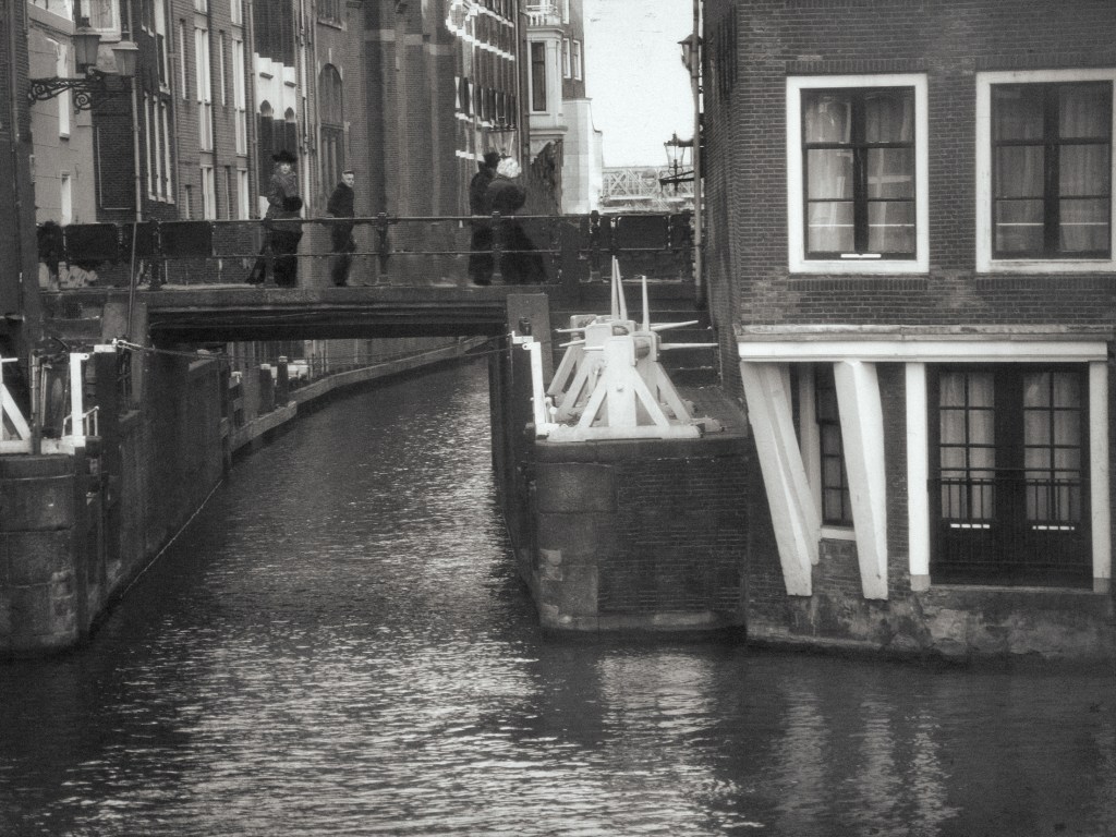

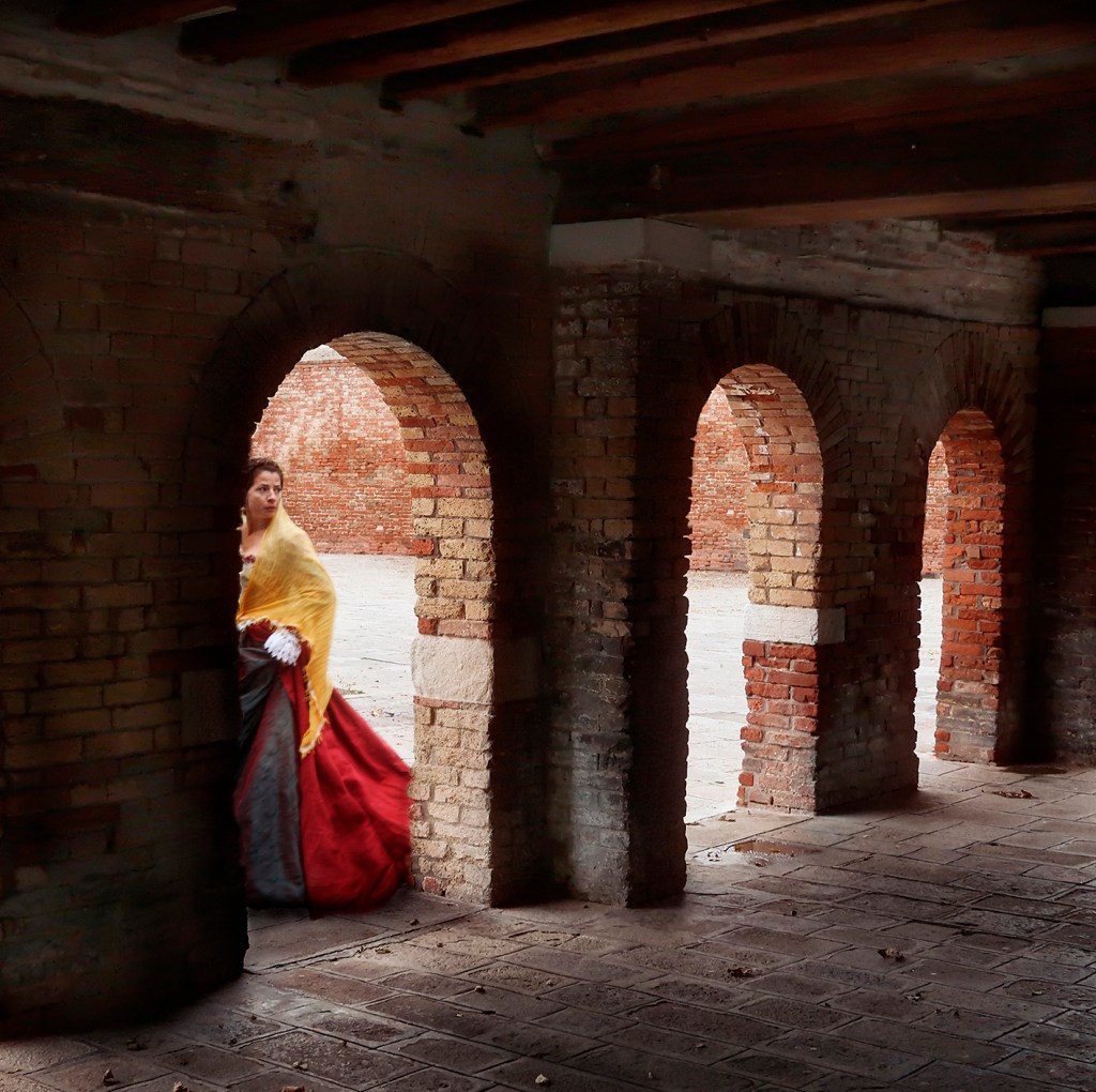


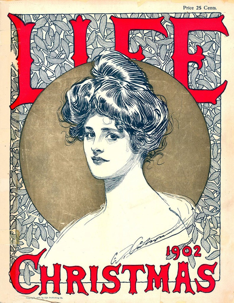
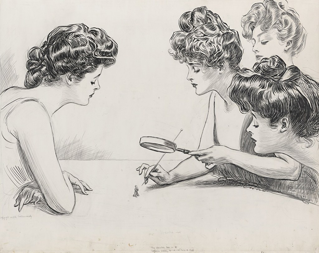


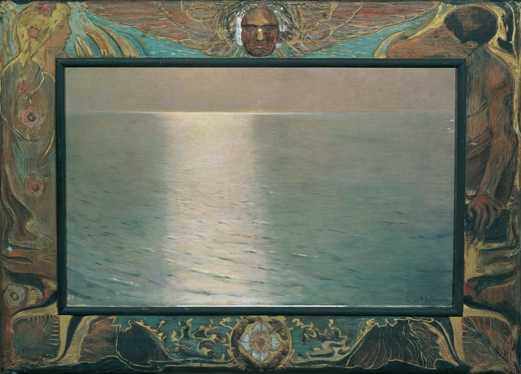
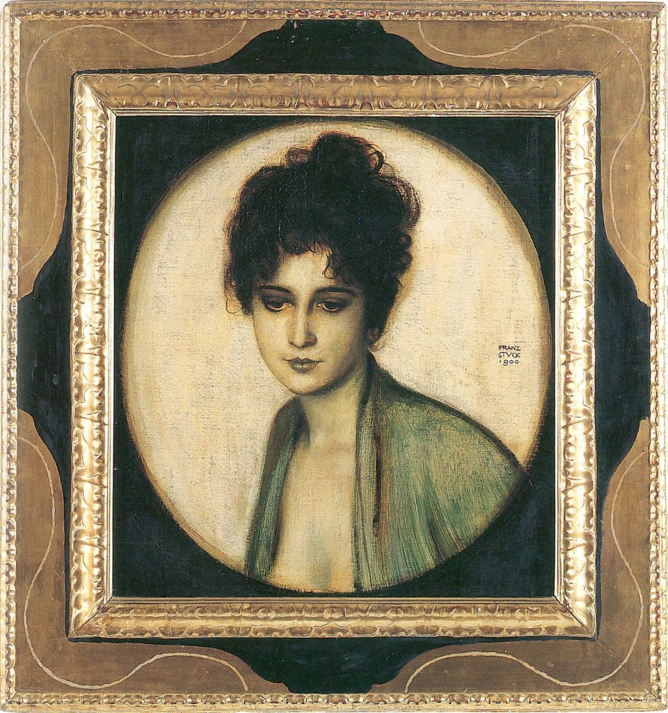


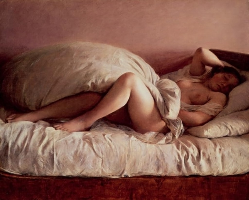
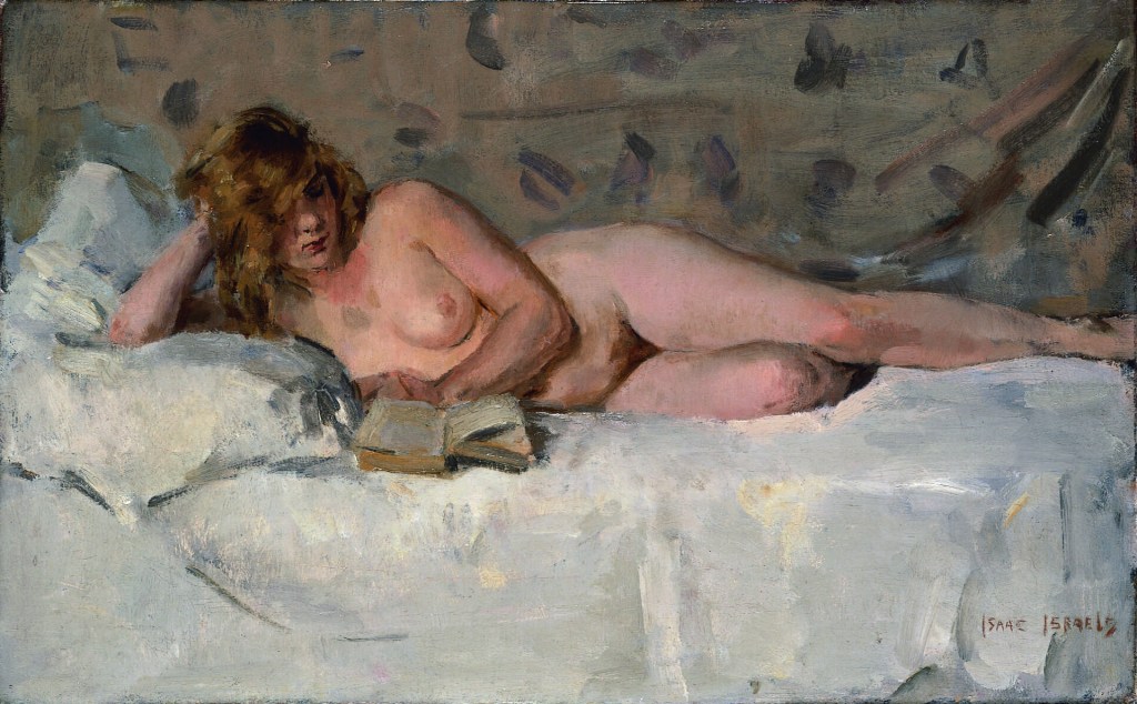


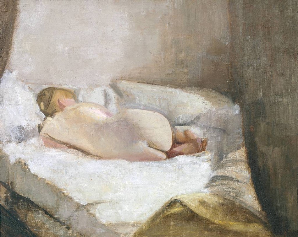
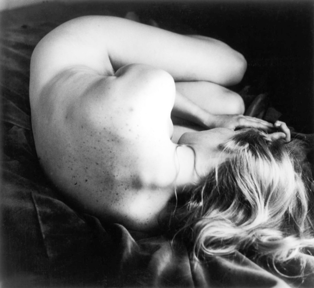


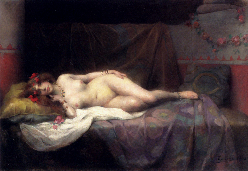


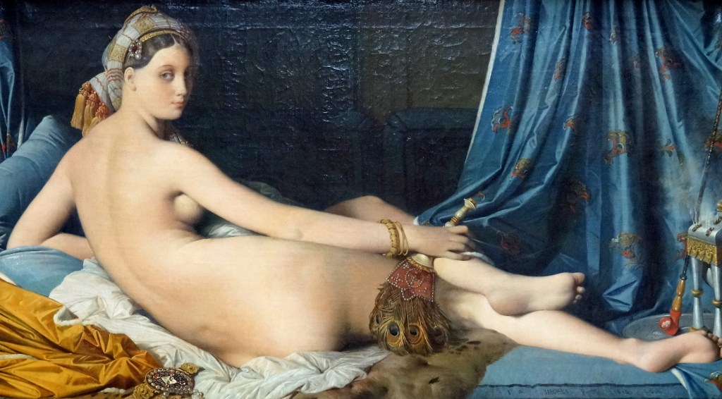


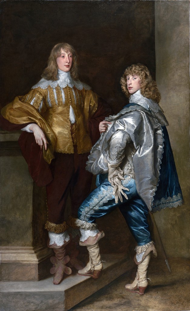

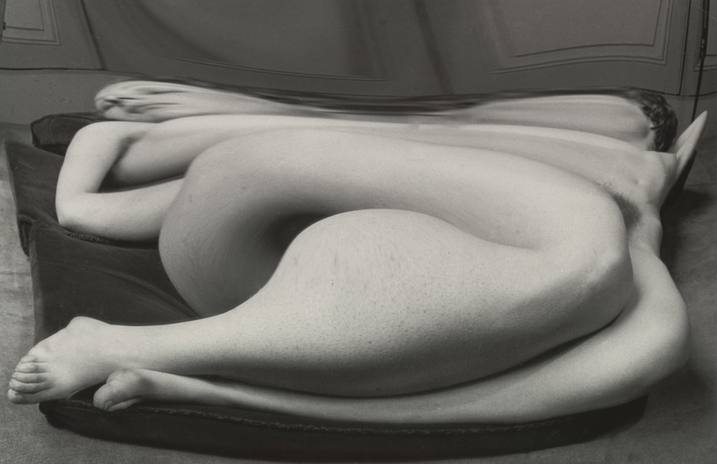


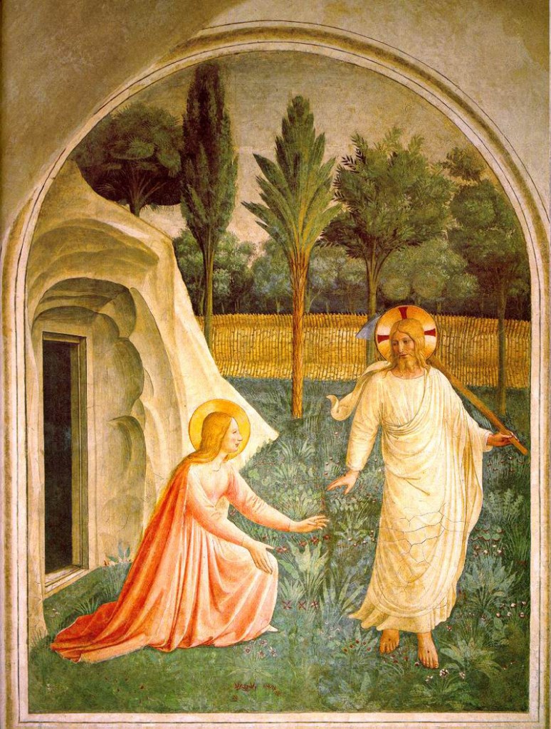
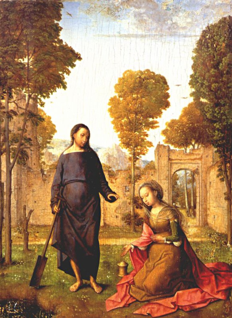

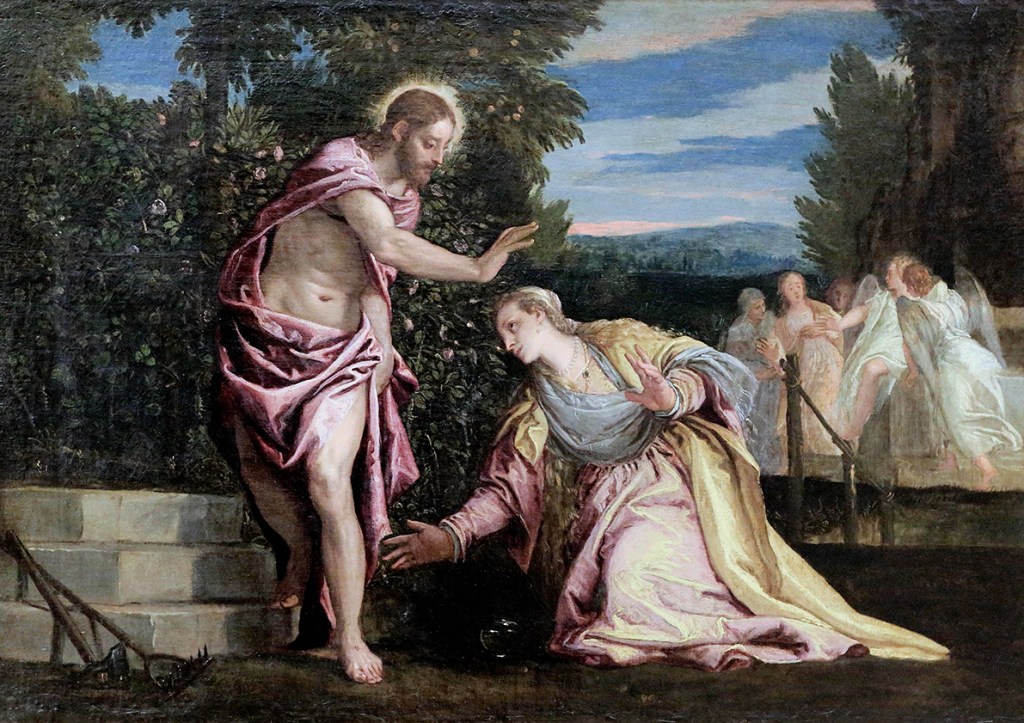

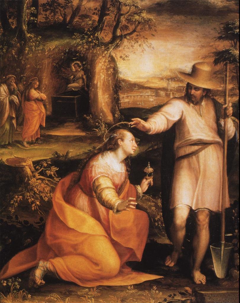


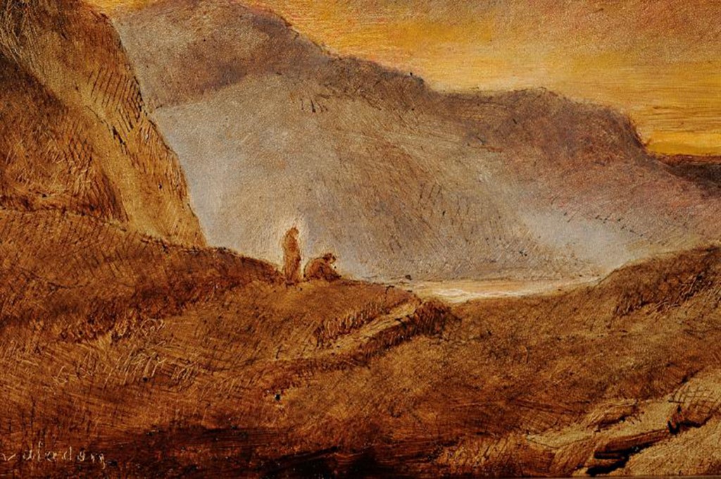


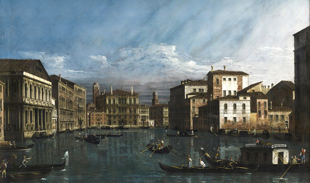

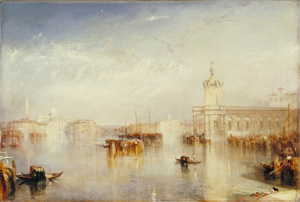


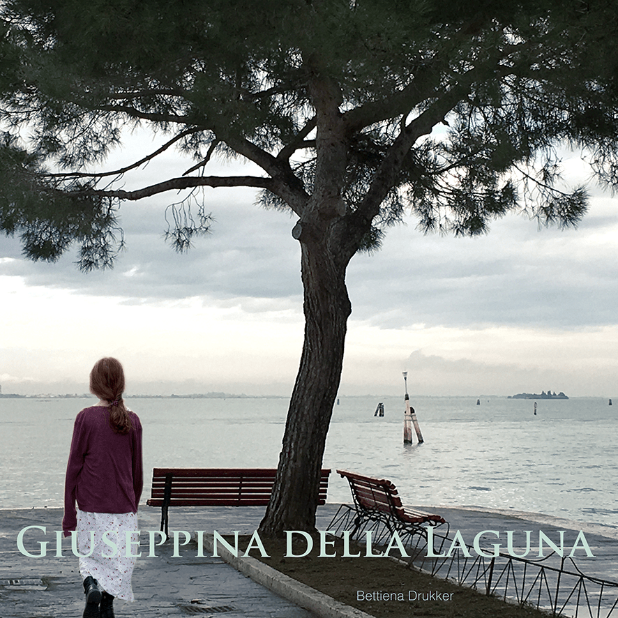
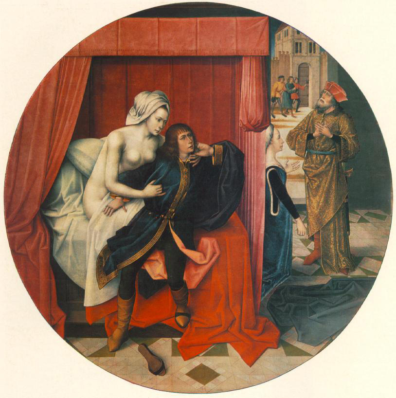


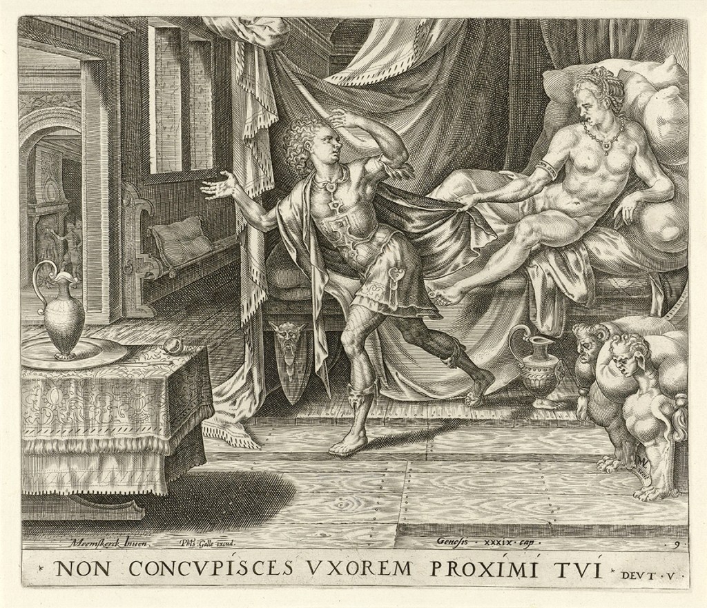


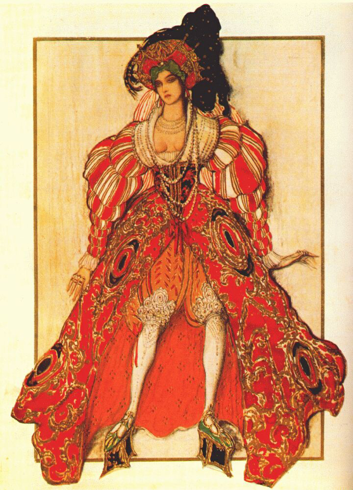


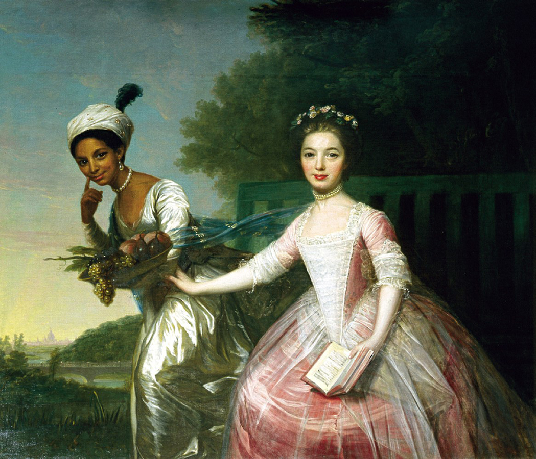

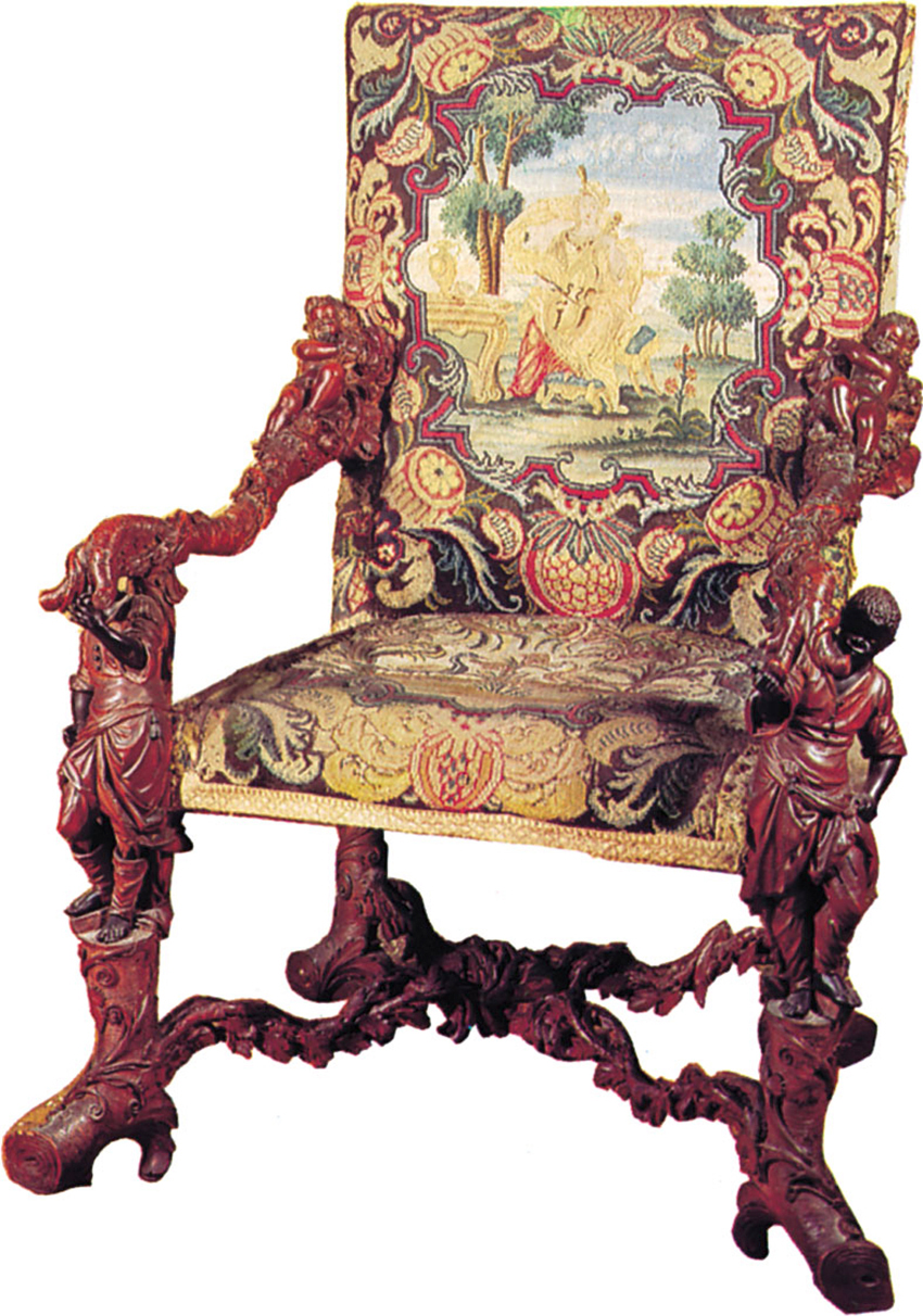


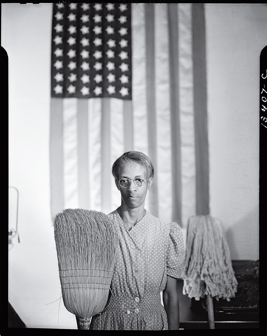


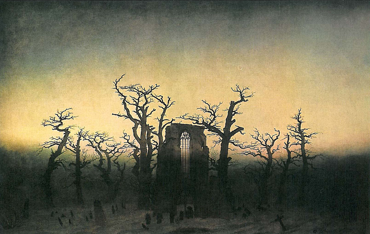

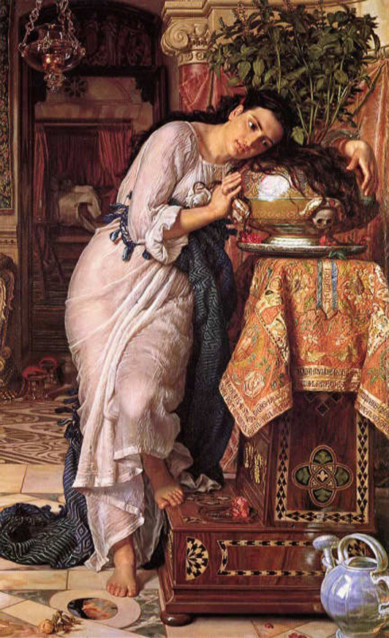
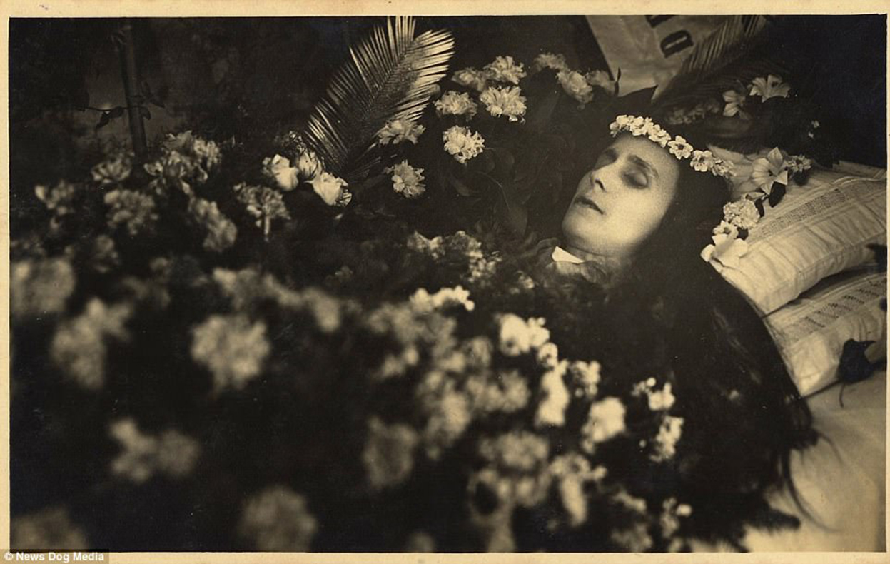


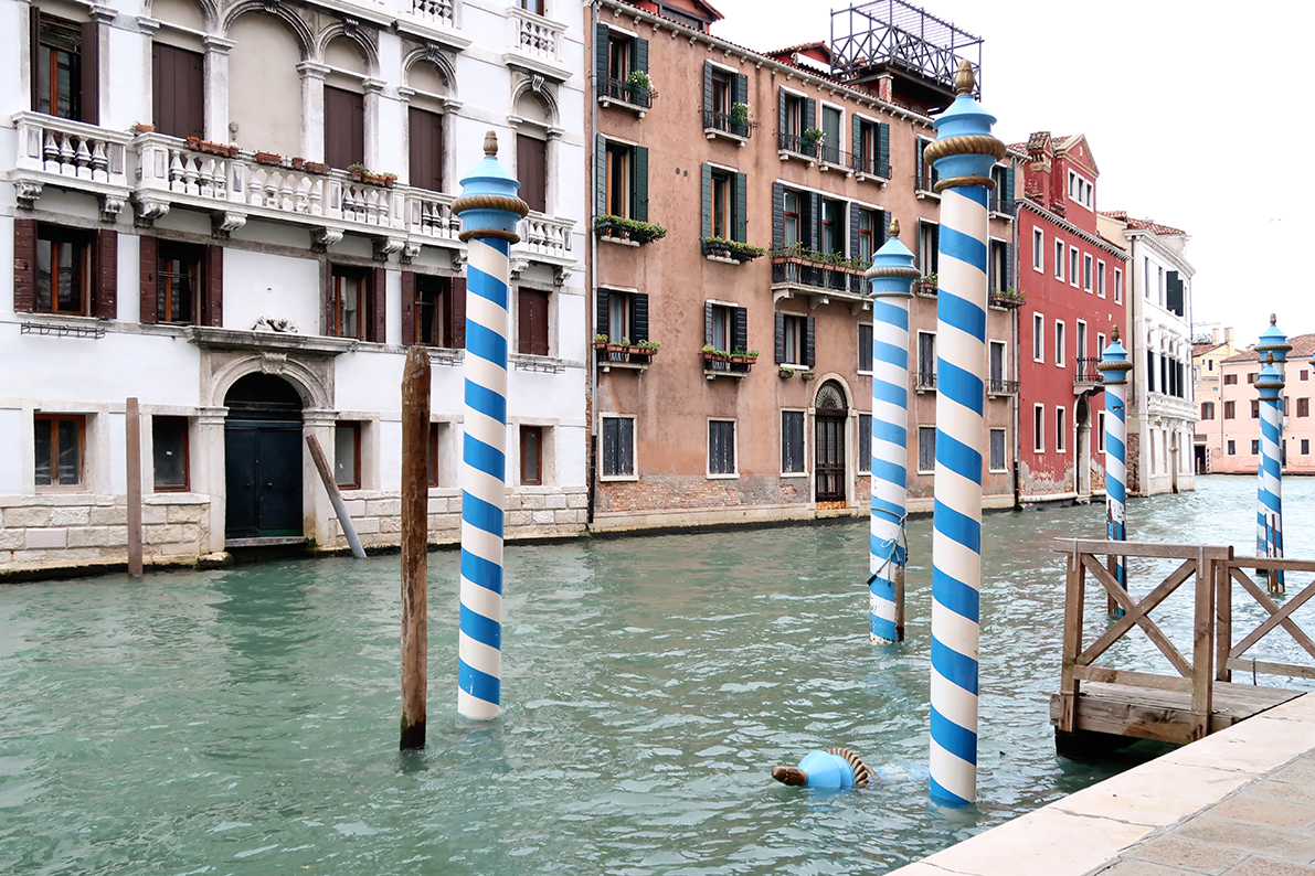
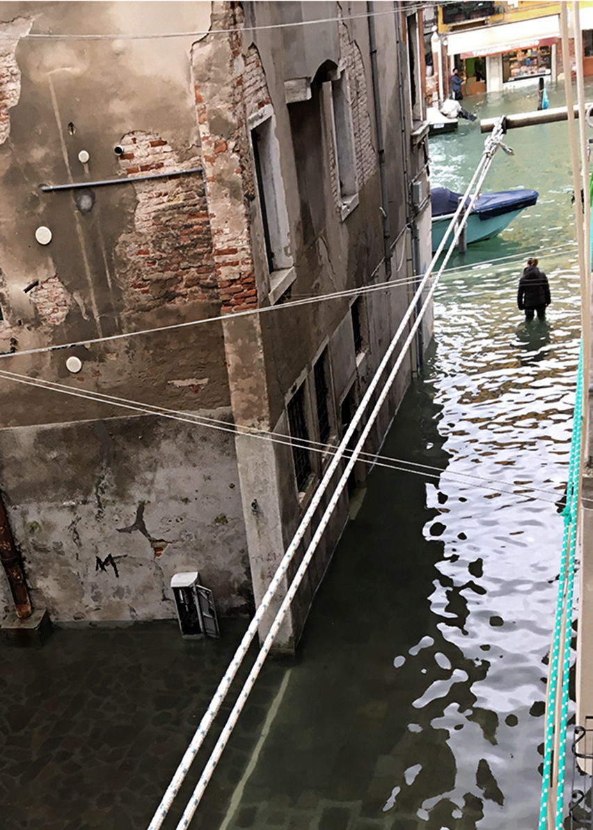


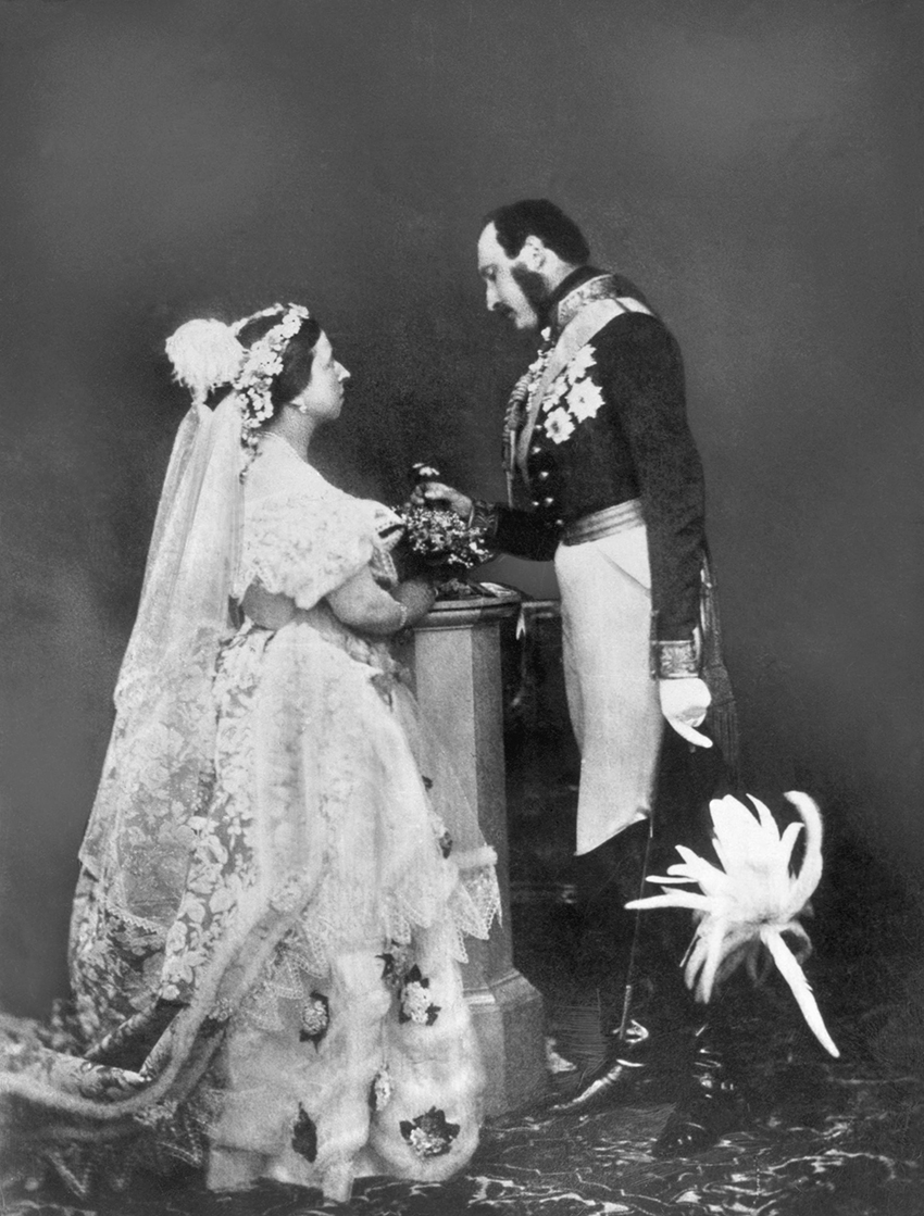
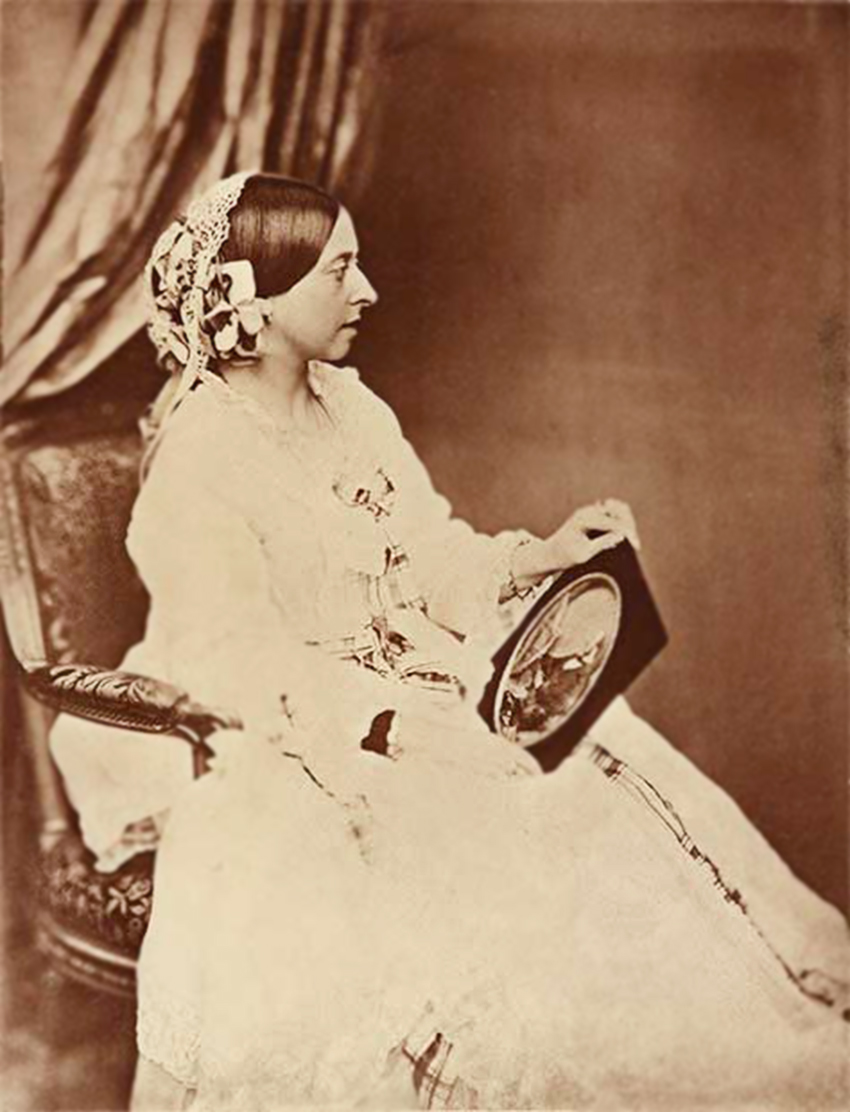

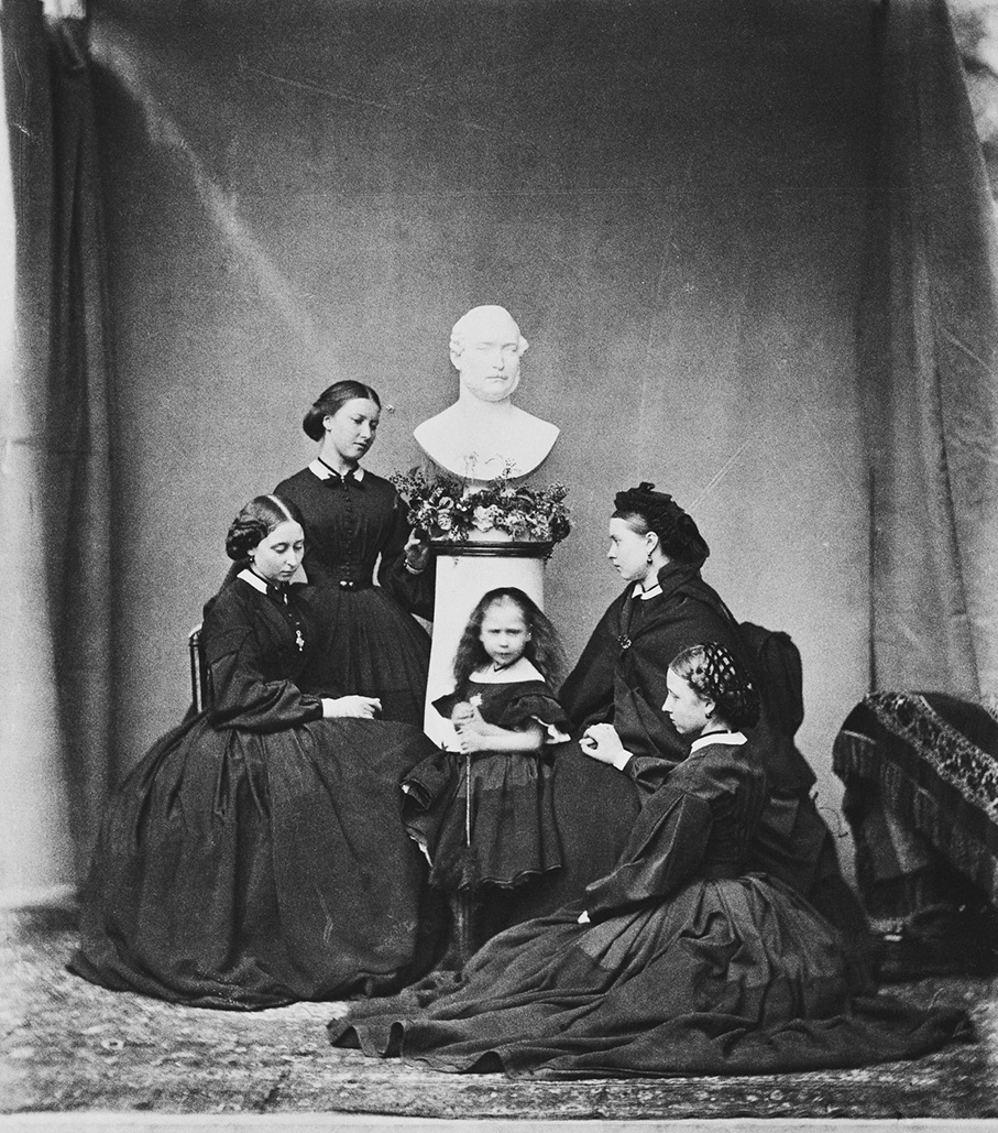


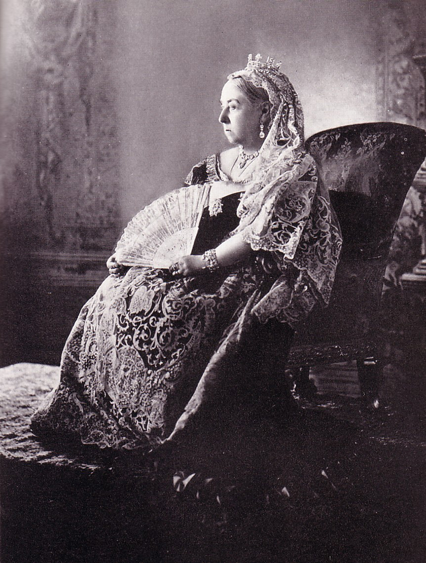
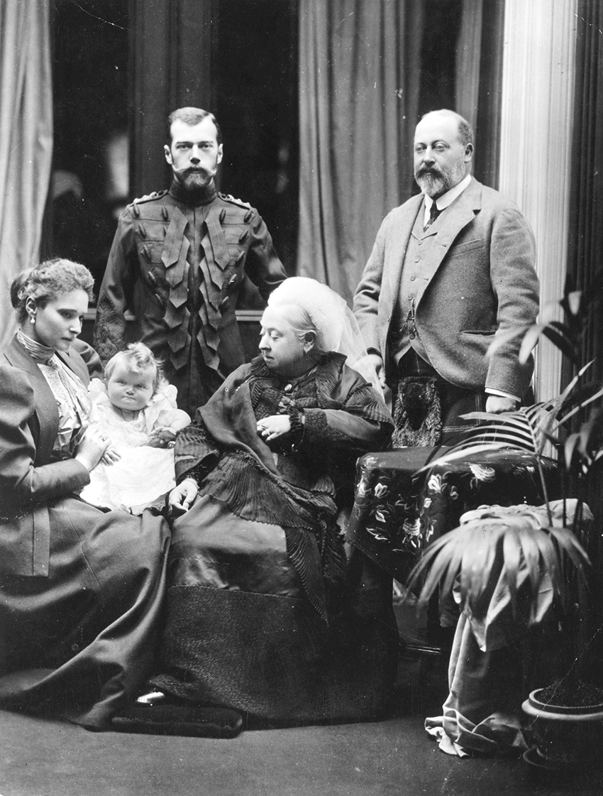


 Daguerreotypie by a certain E. Jacobs. The hand coloring apparently got on E’s nerves, because the plaid on the toddler’s outfit has been slapped on rather coarsely. But craziest of all has to be the prop the little chipmunk is holding. Yes, indeed. A shotgun. At the risk of sounding biased, surely this is American?


 Sergej Prokudin-Gorskii, Georgia, 1912. The tsar was so impressed with SPG’s work, that he gave him a train(!) to travel the gigantic country and document the population. He spent years doing that, until in 1917, suddenly riding around in a gift from the tsar wasn’t really that much fun any more . . . In any case, the end result is stunning, both in a photographic and a demographic sense.


 1783 A rather controversial portrait of Marie Antoinette, by her court painter and friend Elisabeth Vigée-le Brun. It was considered completely inappropriate that the queen was depicted in such a flimsy negligé-like dress. She just could not do right. The collaboration between the two women, who were exactly the same age, produced countless portraits, also very stately ones:
 That’s more like it. Marie Antoinette in full splendor, big hair, and ‘paniers’ under her skirt. Fashion of the day required dresses to be extraordinarily wide, so the women wore undergarments with basket-like contraptions on either hip. Needless to say, that was only for the happy few. No way you could work the land or clean the house in these!
 1790 Self portrait of Elisabeth Vigée-le Brun. She is working on a painting of the queen. Pretty girl, isn’t she?
 1792 Alexander Kucharsky. He made a series of portraits of the queen in captivity. This pastel is unfinished, and worked over by a revolutionary maniac with a club.
 1793 Jaques-Louis David’s sketch of the queen on her way to the guillotine. After the execution the raging crowds dipped their sleeves in her blood (gross!), but she was dignified to the bitter end. She tripped climbing up the scaffold and apologised to the henchman, worried that she had hurt him.
 2000 Cornelia Nauta, l’Autre Coté du Miroir. Marie Antoinette has always been an inspiration for artists – Sophia Coppola mellowed our opinion with her movie, and in the beautifully moving series l’Autre Coté du Miroir, Dutch photographer Cornelia Nauta shows us a different, more human side of the much maligned Rococo queen.
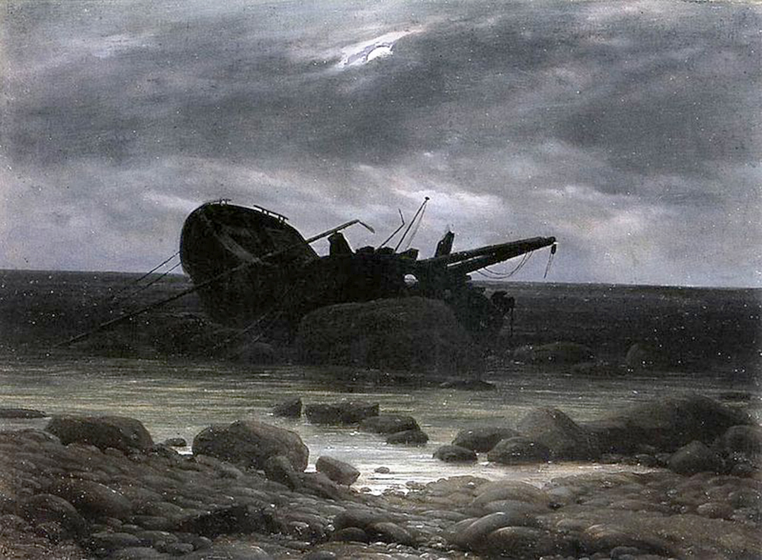


 Tintype, portrait of Taqulittuq and Ipirvik, aka Tookoolito and Ebierbing, alias Hannah and Joe. They were an Inuit couple who in the 1860’s worked as guides and interpreters for British and American expeditions to the Arctic. In a way they were lucky to be able to earn a living that way – during their initial travels they were exhibited . . . horrific. Although they did dine at Windsor Castle then, as guests of Queen Victoria.
 Roger Fenton’s mobile darkroom, 1855. This is how he shlepped all around the Crimean War. The man on the wagon is his assistant Marcus Sparling.
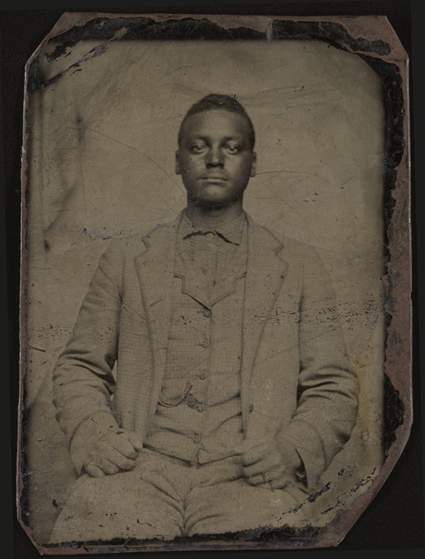 Tintype from ca. 1890. Slightly odd focus here: his face is a little blurred, his checked suit on the other hand . . . sharp as a knife! Still, a beautiful picture. Of course it’s a beautiful guy, too.
 This is a portrait of Billy the Kid, one of the legendary outlaws of the Wild West. The tintype looks rather worse for wear, but it is nothing compared to Billy’s fate – he was murdered by his old friend and partner in crime.
 Your author, and friend and colleague Sylvia Lockhart (check out her website below). These tintypes were made during a wonderful Wet Plate workshop by Daniel Barter (check out his website below, too). As you can tell from all the blobs, the pouring of the collodion was, shall we say, uneven? It’s more difficult than you’d think. The black edges are beaten raw egg, applied with a Q-tip to prevent the collodion dripping off the plate.

 Eugène Delacroix, 1827. The Romantic era (and Delacroix was the “prince of the Romantics”) was steeped in longing for the East. In the East there were harems and in harems there were naked women, so they made a comeback in art, this time in the form of odalisques.