Color photography.
From the very start, photos were being hand tinted, with water based inks or oil based dyes. It was an extremely precise and time-consuming job. At the end of the 19th century Gabriel Lippmann, a French physicist, developed an early form of color photography. He glued together light-reflecting surfaces that, aided by chemicals, used refraction and other physical phenomenons to produce an image. Which unfortunately couldn’t be viewed on anything but the actual plates – it certainly wasn’t reproduceable. Nevertheless, in 1908 Lippmann was awarded the Nobel prize for it.
We know the brothers Lumière, Auguste and Louis, as the founding fathers of the cinema. But – are you ready for this? – they didn’t think there was any future in the moving image, so they turned their energy to color photography. In the camera, they put a glass plate which was covered in the thinnest possible layer of colored starch. This worked as a sort of conversion fliter: it let same colors pass, and blocked the complimentary colors. When projected (like a slide) the result was amazingly realistic. They named their invention “autochrome”. It was based on a fairly simple principle but applying it was far from simple.
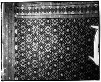
Round about that same period (the beginning of the twentieth century) – and with pretty much the same idea as a starting point – Russian chemist Sergej Prokudin-Gorskii discovered a process where he took, at a dazzling speed, three (monochrome) shots through differently colored filters. He then projected all three images simultaniously, using a specially built projector with three lenses above each other and with specially colored light, rendering astonishingly life-like colors. His system could not be printed either, but luckily the American Library of Congress owns his entire archive and started its digitalisation in 2004. But the maker of what is considered to be truly the very first color photograph, in 1861, is Scottish scientist James Clerk Maxwell, who used roughly the same process for his Tartan Ribbon:

It wasn’t until after WWII that consumer-friendly color films became widespread. And even those weren’t always very stable, which accounts for the many purpley-hued and/or faded aunts and uncles filling family albums all over the world. Since the advance of digital photography analogue color photography is quickly losing ground. No wonder – it is a terribly complicated process that requires a lot of specialized knowledge, materials and equipment. All of which is in rapid decline, and the consensus is that in 20 or 30 years time, there will be no-one left who can handle analogue color photography. As one photo historian said: “When it’s gone, it’s gone.”

In 1859 Herbert Watkins shot a portrait of Charles Dickens. In 2020 Oliver Clyde digitally colored it in, just in time for the 150th anniversary of Dickens’ death on June 9th. (Look at the date of this post! How topical is that?). I read that this clearly proves the writer had a healthy skintone – not at all the stereotypical pallor of the time. No offense to Mr. Clyde, but may I store that under the header ‘far fetched’?
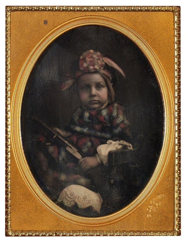 Daguerreotypie by a certain E. Jacobs. The hand coloring apparently got on E’s nerves, because the plaid on the toddler’s outfit has been slapped on rather coarsely. But craziest of all has to be the prop the little chipmunk is holding. Yes, indeed. A shotgun. At the risk of sounding biased, surely this is American?
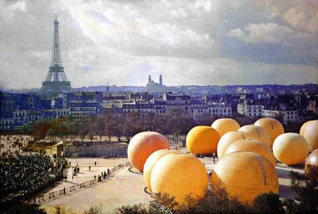
Autochrome 1914. From the enormous collection of Albert Kahn, a French banker who set out to visualize the world through color photographs: Les Archives de la Planète. Unfortunately the Great Depression of 1929 put a spanner in the works. In this shot of a balloon event (they look more like melons!) you can see the grains and the spots of the colored cornstarch.

The Lumière brothers. Left is Auguste, on the right Louis. This is not an Autochrome, but a hand-tinted photo. Aww, somehow that doesn’t seem right.

Edward Steichen The Pond, Moonlight. Mamaroneck 1904. Yet another way to color your photos: the gum bichromate process. You prepare your paper with a mixture of gum arabic, pigment and a light-sensitive component. Negative on top, expose, rinse, and there’s your monochrome print. Repeat with a different color pigment, and a third time, maybe. It sounds fairly simple but it’s not – far from it.
 Sergej Prokudin-Gorskii, Georgia, 1912. The tsar was so impressed with SPG’s work, that he gave him a train(!) to travel the gigantic country and document the population. He spent years doing that, until in 1917, suddenly riding around in a gift from the tsar wasn’t really that much fun any more . . . In any case, the end result is stunning, both in a photographic and a demographic sense.

Caucasus 1912. Here you get an impression of what he did with those filters. Differently colored filters change the rendition of the original colors in a black-and-white pcture. When projected those colors can be recreated. Oh, I get it. Hmmmm. Vaguely.
Russian photographer Pavel Kosenko has a richly illustrated post about SPG on his blog: https://pavelkosenko.wordpress.com/2015/05/26/color-photographs-by-s-m-prokudin-gorsky-1863-1944/

From your blogger’s archives. A seriously bleached out Versailles. But don’t be fooled, this shot is only a few years old. Nowadays, we have yet another tool to determine the color of our pictures: Photoshop. This is filter “Warm Skin, Fading” . . .
